
Hi, I’m looking for some answers to some questions I have on a visualisation I’ve produced as part of my coursework.
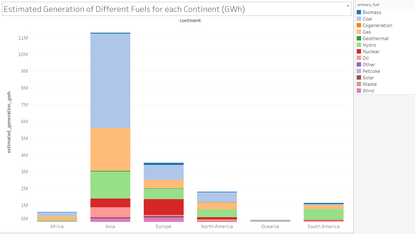
Visual Design: Stacked bar graph
Name of Tool: Tableau
Country: All countries with an estimated generation value
Year: All years used in the dataset
Visual Mappings:
X-Axis: Continent
Y-Axis: Estimated generation (GWh)
Colour: Primary fuel
Unique Observation: This graph shows that Asia generates a massive amount of energy compared to the other continents and is the leading continent in coal, gas and hydro usage to produce energy.
Data Preparation: I added continent a continent column in the csv file and filtered out the null values.
Dataset: http://datasets.wri.org/dataset/globalpowerplantdatabase
Questions:
Does my visual design present the information well?
Are there better colours I could choose to help differentiate the fuel types more?
Is there another visual design that would be better for this?
Thank you!