Hello I am a Swansea University Student studying Data Visualisation and have produced some representations of the Global Power Plant Database data set, here is one. This Gantt Chart represents created power plants against the fuel source they use to show that as the years change so does the type of power plants created.
Image:
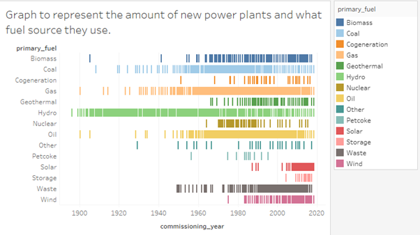
Source : Global Power Plant Database - Datasets - WRI ODP
Visual Design Type: Gantt Chart
Name of Tool: Tableau Desktop
Country: All countries
Year: All years
Visual Mappings: Colour: primary_fuel
X-axis: commissioning_year
Y-axis: primary_fuel
Data Preparation: Removed null data
Observation: As the years increase so does the amount of renewable power plants that are created also less non-renewable plants are created.
Questions:
- Does the graph represent the data clearly?
- Any advice on other visualisation techniques that could present the same data more clearly?
- Could the chart be clearer when it represents the data? Eg Increase the X-axis to make the points more obvious and not just a block.
Thank You.