
Image:
Visual Design Type:
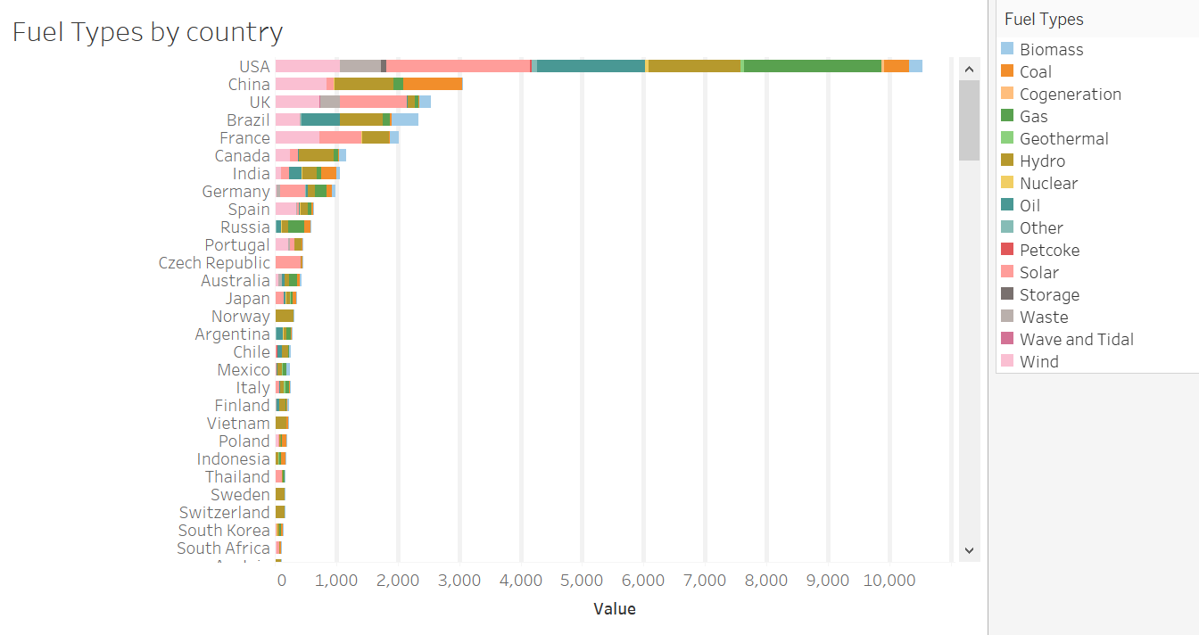
Stacked Bar Chart
Name of Tool:
Tableau
Country:
All countries
Year:
All years
Visual mappings:
Row: The Country Name of A Power Plant
Column: Count of Fuel Types A Power Plant supplies
Unique Observation:
USA has the most fuel types in total than other countries.
Sources:
Data: http://datasets.wri.org/dataset/globalpowerplantdatabase
Data pre-process:
Setting 15 new fields to identify whether a country uses that particular to generate electricity
References:
Indratmo, L. et al., 2018. The efficacy of stacked bar charts in supporting single-attribute and overall-attribute comparisons. Visual Informatics, 2(3), pp.155–165.
Question:
How can my visual design be improved?