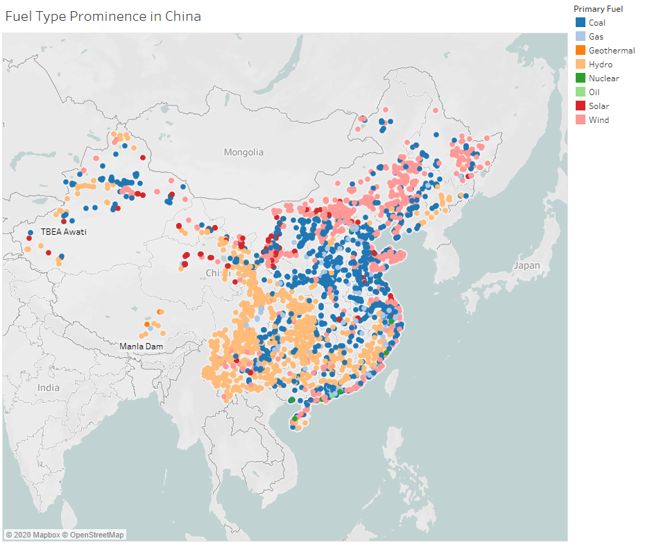
Visual Mappings: Map shows the location of power plants in China. Each dot represents a power plant based of its longitude and latitude. Each dot has a colour that represents the type of energy source used in that power plant.
Unique Observations: Hydro and Coal account for most of the power generated in China. Wind farms are located in the north of the country, which high wind speeds ideals for wind energy production.
Data Preparation:
Countries are filtered to only include China.
Colours are edited to uniquely represent each power source.
Question:
Is this an effective way to show the groupings of energy types in China? Can things such as colour and the overall look of the Map be improved upon?
Thanks very much for taking the time to look at my graph, and for any feedback you may have!
This map visualisation does overall show the grouping and spread of different power plant types and is visually appealing.
However, from this map, it is a bit difficult to tell the total amount of power plants, if that is what you going for. For example, after investigating China in similar conditions using the same data set in Tableau, there seems to be a very small amount of geothermal and oil plants, which is not clearly seen on the map just how many there are. It is hard to spot any geothermal plant on this map, and I believe the colour palette is contributing to this by allowing geothermal and hydro plants to have similar shades.
Perhaps a packet bubbles visualisation can do a better job at showing the groupings of different power plant types next to each other.
Another suggestion would be to add a chart or graph visualisation to accompany this map, which would put the proportions of power plants types in a better perspective.
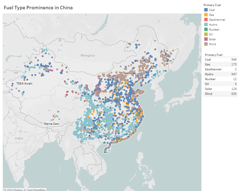
AlexRasa, Thank you very much for your feedback. I created the packed bubble visualisation like you suggested, but when trying to display both visualisations, it ended up shrinking the text down so that it was impossible to see the values of the bubbles. I opted for a seperate legend to show the values and switched the colors on the map. What do you think?
vauxden,
I find this to be a clear improvement over the previous map, all the different power plant types are more distinguishable, and the geothermal and oil plants are easier to spot.
The legend table is a nice touch and I think it achieves adding more perspective to the map.
As a final suggestion, I would sort the values in the legend by ascending/descending order of power plant count and give the column a name.
Glad I could be of use : )