
Data set: http://datasets.wri.org/dataset/globalpowerplantdatabase
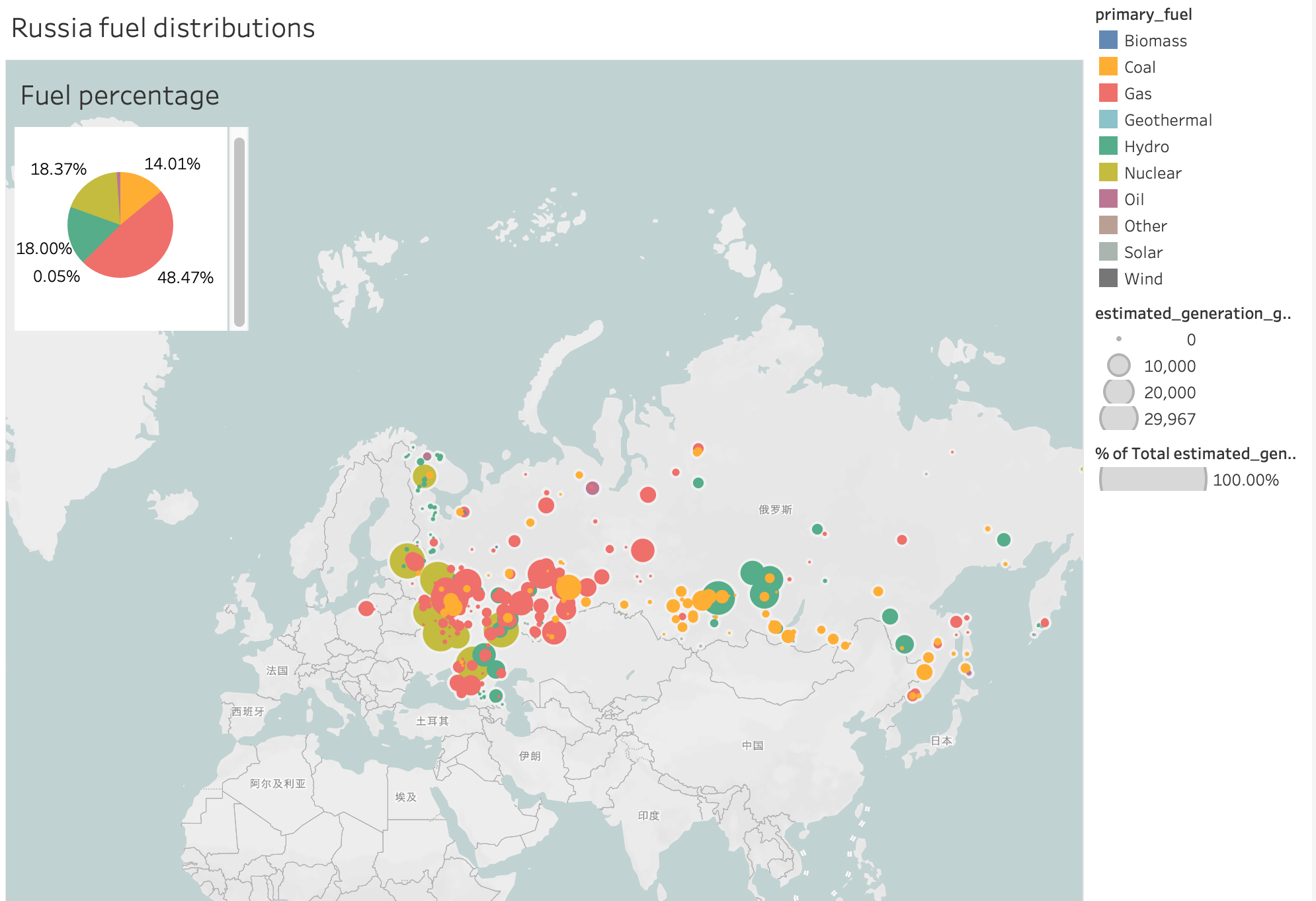
Visual Design type: Map+pie chart
Country: Russia
Year: all years of the dataset
Visual mapping:
colour : colour mapped different primary fuel categories
size: size of the estimated generation of different fuel types
Pie chart: all types of fuel distributions
Unique Observation: Gas plays an important role in Russia. Most power plants are located in the border of the country.
Reference: Wesley, R., Eldridge, M., & Terlecki, P. T. (2011, June). An analytic data engine for visualization in tableau. In Proceedings of the 2011 ACM SIGMOD International Conference on Management of data (pp. 1185-1194).
Question:
Does my visual map make sense?
Please give me some advice to improve it.
Thanks for your time.