
Hello,
I am a student studying computer science at Swansea University, we are working on an assignment that involves exploring data from Project Tycho (https://www.tycho.pitt.edu/) and applying various analytical tools and techniques in order to make various observations. Here is a treemap that I have created in Tableau, representing information on meningitis and meningococcal meningitis within 10 US States, more details can be found below:
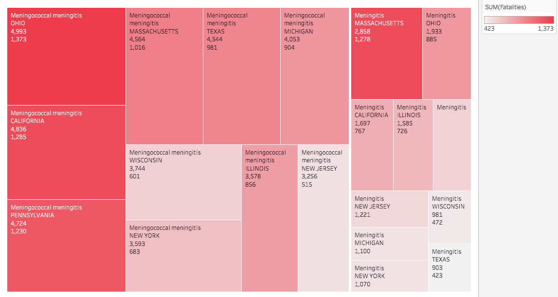
• Visual Design Type: Treemap.
• Name of Tool: Tableau
• Country: U.S.
• Disease: Meningitis and Meningococcal Meningitis
• Year: 1905-1964
• Visual Mappings:
– filter: the top 10 states with the highest number of records for both types of meningitis were filtered out for use.
– Colour: colour is mapped to the difference between the number of fatalities among the different states.
– Shape: each bottom level rectangle represents a state.
– Size: the size of each bottom-level rectangle is mapped to the number of records for each respective condition for a given state, while the size of each higher-level rectangle represents the number of records for each condition.
– Position: the position of each rectangle/state is determined by decreasing frequency in the number of records, the more records a state holds, the further it is to the left.
– Hierarchy: the states are grouped by disease → state
• Unique Observation: We can easily compare rates of both diseases and fatalities within states, i.e., We can see that Wisconsin has a lower rate of fatalities for both diseases comparatively to other states. We can also see that for its rate of Meningococcal Meningitis Texas has a relatively low rate of Meningitis, whereas other states tend to place at similar positions within each condition.
• Data Preparation: In order to create the hierarchy, the datasets for Meningitis and Meningococcal Meningitis within the US were combined.
• DOIs:
Meningitis: 10.25337/T7/ptycho.v2.0/US.7180009
Meningococcal Meningitis: 10.25337/T7/ptycho.v2.0/US.192644005
So here I have a couple of questions, if anyone would like to help out it would be greatly appreciated!
- Does my treemaps hierarchy make sense and is there any better technique available to explore this data?
- Does my explanation of the mapping make sense? Is there any information I seem to have left out?
Thank you very much for your time!
Reference:
Kong, N., Heer, J., and Agrawala, M. Perceptual
guidelines for creating rectangular treemaps.
Visualization and Computer Graphics, IEEE
Transactions on 16, 6 (2010), 990–998.
(https://idl.cs.washington.edu/files/2010-Treemaps-InfoVis.pdf)