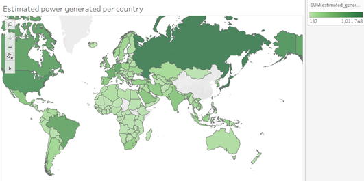
Visual Design = Map
Tool used = Tableau
Country = All countries in source data
Year = 2018
Visual mappings
- Color = darker green to signify more power generated
Unique observation – Without china excluded from the map, the rest of the map all look like 1 color. This signifies that china is estimated to make a lot more energy than anyone else in 2018
Question
Is the color scheme easy to understand or should I change try something else?