
Guideline : Greetings, I am a Swansea University student working on a Data Visualization assignment, whereby I need to create visualizations from the following dataset in order to maximize our understanding of the data and to reach some conclusions in terms of helping a green energy company grow.
I would appreciate it if you could provide me with some recommendations as to how I can make this visualization better in terms of helping the viewer understand the concept and be able to infer the information it’s trying to provide them with.
Thanks in advance.
Image :
Source: http://datasets.wri.org/dataset/globalpowerplantdatabase
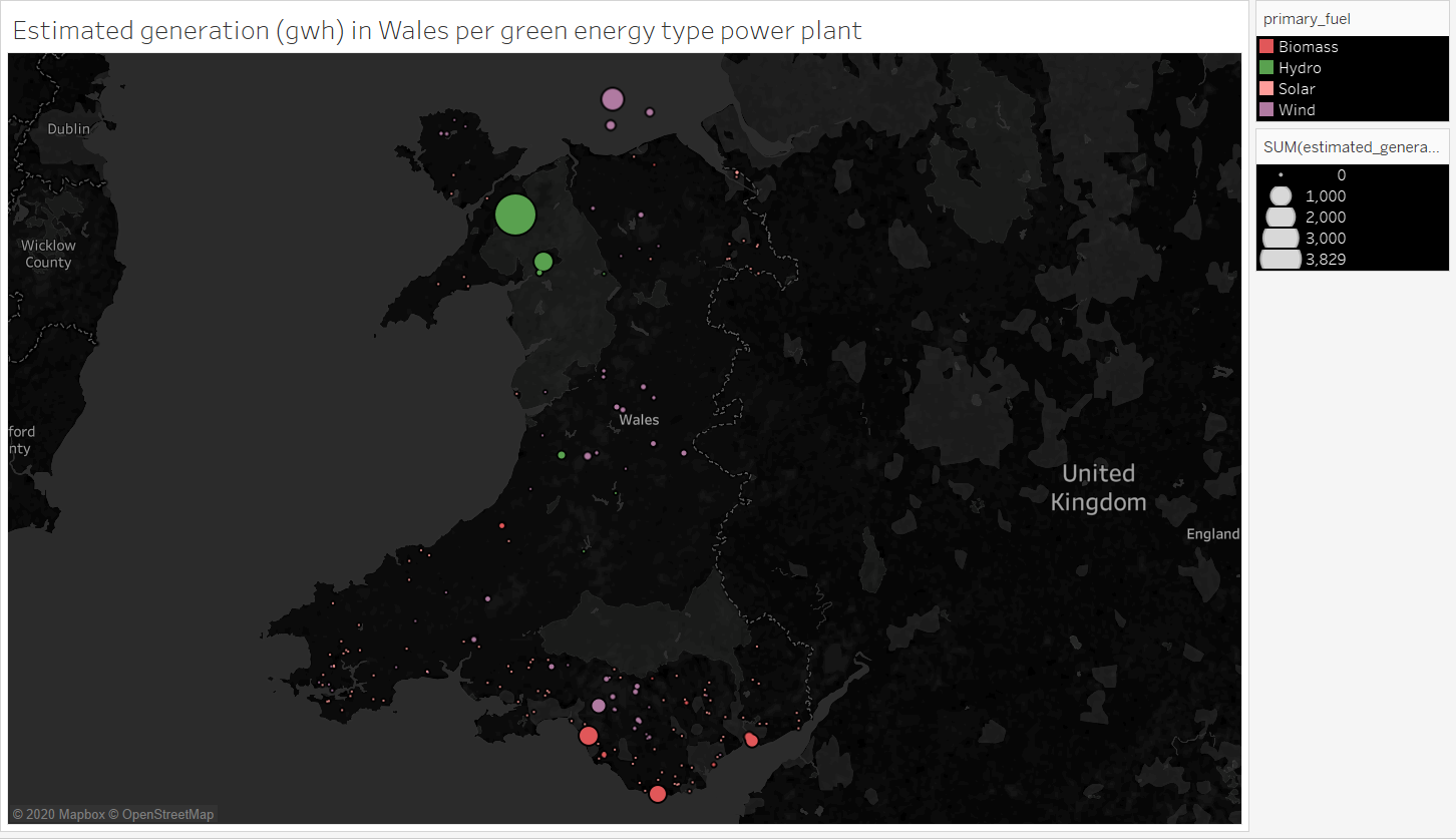
Visual Design Type: Symbol Maps
Name of Tool: Tableau
Country: Wales
Year: 2018
Visual Mappings:
Size: Sum(estimated_generation_gwh)
Colour: primary_fuel
Unique Observation: Most of Wales’ power generation happens in the north and south parts in terms of location. The north is a mixture of Hydro and Wind power, whereas in the south it’s mainly Biomass and Wind, with many smaller Solar plants dispersed in the general area.
Data Preparation: None