Question:
I’m working on a visualisation involving a choropleth map of the world, and I’m starting to doubt my use of visual encodings; specifically the hue and saturation of the countries.
Currently, I am encoding a categorical attribute to the hue of the countries, as it seems to be the best channel for categorical attributes given the context of a map.
Additionally, I am encoding a quantity for each country to its saturation, binned such that there are five possible saturation values which encompass the quantity’s range along a logarithmic scale. A higher quantity makes the country’s hue more saturated:
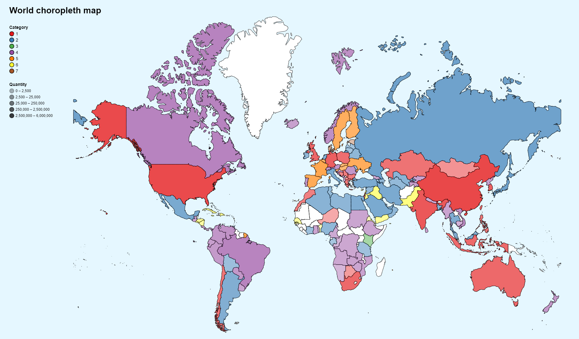
Vis generated with Altair.
My issue is with the user’s ability to compare the quantitative values between countries, and especially those of different categories, as it seems to be difficult to determine saturation despite using a perceptually uniform colour set.
I’ve looked at some literature on the matter, and Ward, Grinstein, & Keim state that the combination of saturation and hue for encoding can only really provide a capacity of ~13 discrete values, where my visualisation incorporates 7 (hue) x 5 (saturation) = 30 values. Additionally, Munzner’s channel rankings for ordered attributes summarises that colour saturation is perceived fairly weakly.
I’m finding it difficult to choose a different encoding for the quantity, as others appear unsuited for use on a map (position, length, tilt, area). How could I improve this this and make comparisons easier? Should I change it at all?!
Hopefully someone can give me a different perspective on the issue. Thanks for reading!
[Ward, Grinstein, & Keim/Halsey & Chapanis] - Ward, Grinstein, Keim. (2015). Interactive Data Visualization: Foundations, Techniques, and Applications [p. 129]
[Munzner] - Munzner, T. (2015). Visualization Analysis and Design [pp. 102-103]