
Hi,
I’m a student at Swansea University and one of my assignments is to create visualisations for the Power Plant data set linked at the source section below.
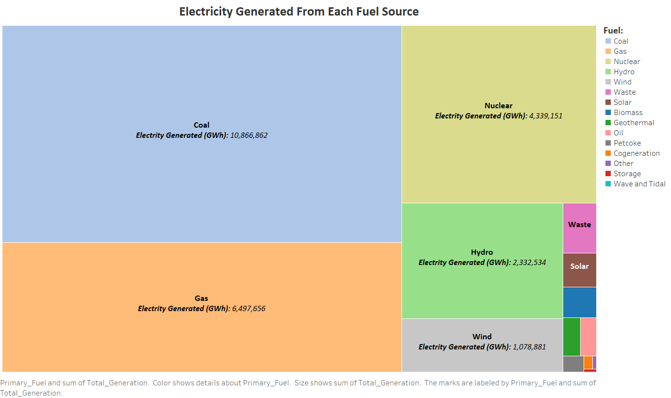
One of my visualisations shows the total electricity generated from each fuel source.
Please answer the questions provided at the end if you can. This will be much appreciated.
Thanks!
Image:
Reference: https://www.spglobal.com/platts/en/products-services/electric-power/world-electric-power-plants-database
Source: http://datasets.wri.org/dataset/globalpowerplantdatabase
Visual Design Type: Tree Map
Name of Tool: Tableau
Country: All (in the data set)
Year: 2013 – 2017
Visual Mappings:
- Colour: Categorical. Based on the fuel source.
- Mark: Square/ Rectangle
- Size: Total electricity generated
Data Preparation:
- For the columns ‘generation_gwh_2013’ to ‘generation_gwh_2017’, any missing values are set to 0 and any negative values are set to positive.
- Perform a GroupBy on ‘primary_fuel’, with a Sum aggregation on columns ‘generation_gwh_2013’ to ‘generation_gwh_2017’. This will show the electricity generated for each fuel source between 2013 – 2017.
- Added a new column called ‘Total_Generation’ which is the electricity generated between 2013 – 2017 added together. This is done for each fuel source.
Unique Observations:
- Majority of the electricity has been generated by using non-renewable energy.
- Coal has generated the most electricity.
- Storage has generated the least electricity.
- Wave and Tidal has generated no electricity
- Coal has generated more electricity than Nuclear fuels and the lesser fuels combined.
- Nuclear has generated more electricity than Hydro fuels and the lesser fuels combined.
- Wind has generated more electricity than Waste fuels and the lesser fuels combined.
Questions:
- Can you tell the fuel types apart based on their colour (even the non-labelled ones)?
- The fuels are ordered largest to smallest of their electricity generation on the legend. Does this help identify the fuels on the tree map better?
- Any improvements that can be made on the visualisation?
If needed, you can provide any comments relating outside of the questions.