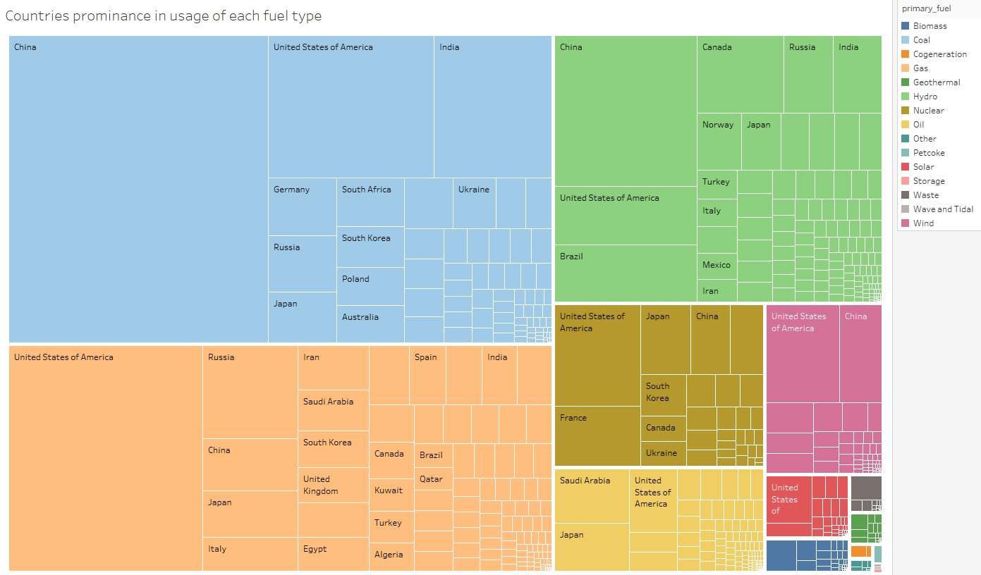
I have created a treemap to represent the prominence of each country within the usage of each fuel type.
While I have no offensive issues with the current colouring, my question is that should the colouring be based off the fuel type?
Would it make the visualisation more intuitive to base the colours off of the fuel type or should I stay away from doing this due to colours maybe not being optimal for the colourblind?
Also in a more general sense should colouring aim to be contextual, easiest to tell apart, or some mix of both?
And of course I would appreciate any other suggestions for changes.