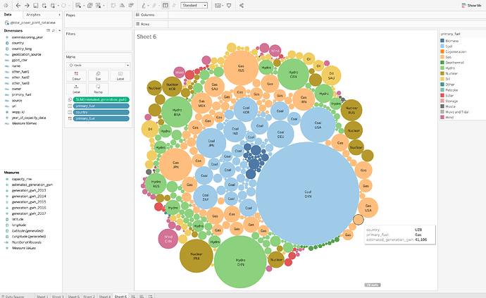
Guideline: The Visualisation looks at the fuel types that are responsible for most/least of the power generation.
Visual Design Type: Packed Bubbles
Name of Tool: Tableau
Country: U.S., UK, Japan, Germany, Australia, Mexico Brazil, Argentina, Venezuela, France, Italy and 153 other countries.
Year 2013 to 2017.
Visual Mapping: Colour: mapped to the type of primary fuel, Shape: circular represents the country and fuel type, Size: represents the amount the type of fuel used in each country (the larger the more common).
Unique Observation: We can clearly see the most fuel type is responsible for most power generation is Coal and gas is one of the most commonly used.
Source: http://datasets.wri.org/dataset/globalpowerplantdatabase
Reference: endcoal.org/global-coal-plant-tracker/
Question:
Does this visualisation make sense?
Can I make it better?
Are there any other types of visual layouts that would be better for this challenge?

