Hello all. I have created a visualization using the below referenced dataset. It shows the distribution of power plants across Norway and Sweden and the estimated generation for each fuel type.
Image:
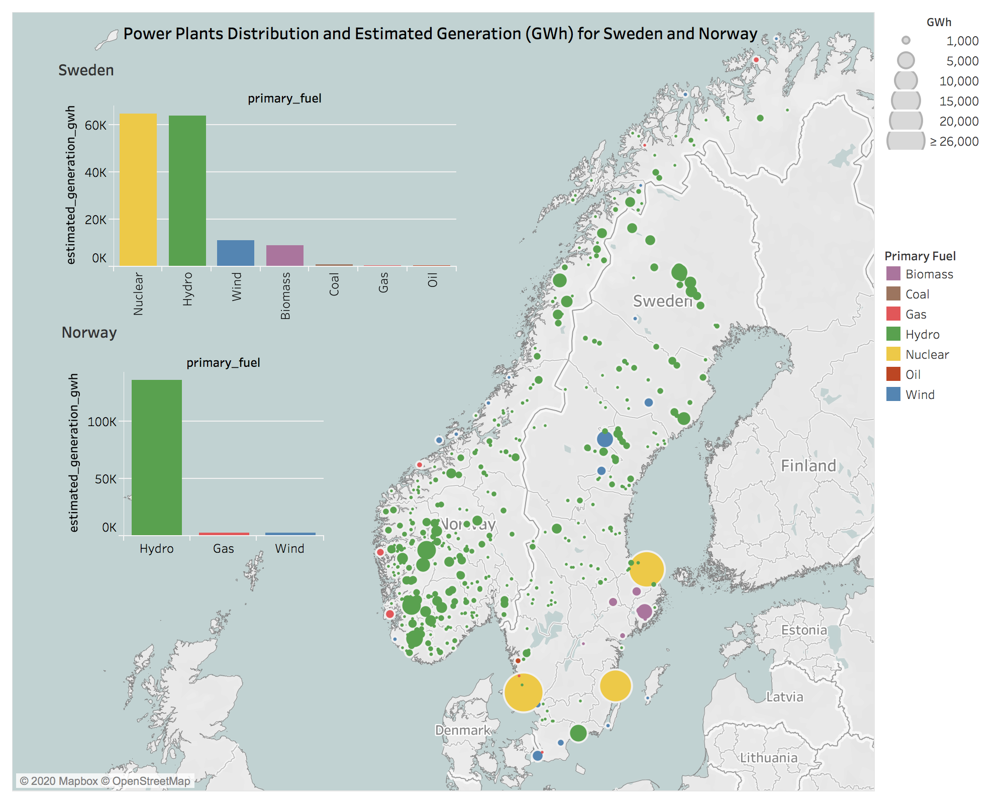
My question: Does this visualization convey too much information by combining the map and bar charts? If so, how can it be altered?
Visual Design Type : Map + Barcharts
Name of Tool : Tableau
Country : Sweden, Norway
Source : http://datasets.wri.org/dataset/globalpowerplantdatabase
Reference: Nordic Energy Research. 10 Insights into the Nordic energy system. 2018.06.14.
Year : 2013-2017 (Estimated)
Visual Mappings :
Map:
X-Axis, Y- Axis : Longitude , Latitude
Mark : Circle
Size: Sum (Estimated_generation_GWh)
Colour : Primary Fuel (Automatic Colour Palette)
Barcharts:
X-Axis, Y- Axis : primary_fuel , Sum(Estimated Generation)
Mark : Bar
Size: Sum (Estimated_generation_GWh)
Colour : Primary Fuel (using Automatic Colour Palette)
Filters: Country: Sweden, Norway
Unique Observation :
- Sweden Generates the same amount of output (Around 64,000 GWh ) from It’s 3 nuclear plants to its approx. 100 Hydro plants (Around 63,000 GWh).
- Norway generates nearly all of it’s power from hydro plants.
Data Preparation :
- Aggregation of estimated generation GWh.
- Filtering latitude range (-179.1338 to 177.4995)
- Filtering latitude range (-34.227 to 71.292)
Thank you in advance.