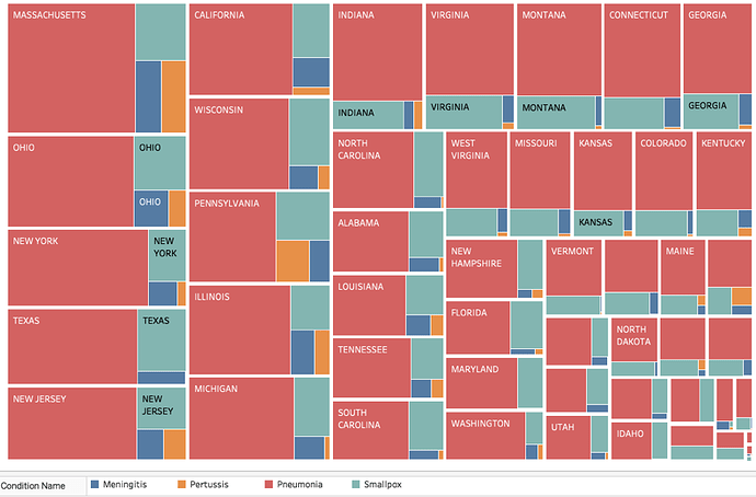
I am a swansea university student that has been given the task to create visual designs for data from Project Tycho (https://www.tycho.pitt.edu/).
The visual design I have created is a Treemap which shows the states with the highest amount of fatality rates between the years 1900-1950 and what disease out of Meningitis, Pertussis, Pneumonia and Smallpox from each of these states make up the majority amounts of fatalities. This will show me the most fatal disease for each of the States across America.
Visual Design Type : Treemap
Name of Tool : Tableau
Country : United States of America
Diseases : Meningitis, Pertussis, Pneumonia, Smallpox
Year : 1900-1950
Visual Mappings :
-Text: this is mapped to the name of the States to make it easier to tell which is which.
-Colour: this is mapped to the different diseases
-Size: this is mapped to the amount of fatalities for each of the diseases from the year 1900 to 1950. For each state, there is a large rectangle to represent it, the size of this is the amount of fatalities for all of the diseases from the state. Inside the states rectangles are smaller rectangles that each represent a disease, the size of these are mapped to the amount of fatalities that the disease has caused for the state that it is inside of.
-Position: the position of the elements shows which state/disease has the most amount of fatalities at first glance, the larger amounts go toward the left and smaller to the right. The largest are in the top left and smallest are in the bottom right.
-Hierarchy: This is grouped by States then inside of each state is the Diseases which show the total amount of fatalities.
Unique Observation :
It is clear that within my Treemap it shows that Pneumonia is the deadliest disease out of the four diseases from the 1900-1950 time period, this is the cases for every state. The rest of the states also have Smallpox as the second deadliest disease.
Data Preparation :
To prepare my data I had to acquire 4 different datasets for each of the diseases that I wanted to visualise. Once acquired I then combined these into a new spreadsheet to form my dataset so I could create the Treemap.
DOI :
Meningitis: 10.25337/T7/ptycho.v2.0/US.7180009
Pneumonia: 10.25337/T7/ptycho.v2.0/US.233604007
Smallpox: 10.25337/T7/ptycho.v2.0/US.67924001
Pertussis: 10.25337/T7/ptycho.v2.0/US.27836007
Literature :
When I was trying to come up with an idea for my Treemap I found an article on “The Wall Street Journal”, which is titled “Battling Infectious Diseases in the 20th Century: The Impact of Vaccines”, written by Tynan DeBold and Dov Friedman. Within this article are heat map visualisations of diseases from the 1920’s to 2010’s, the heatmaps show the amount of cases of the diseases for each of the US states over the years. This made me wonder what the fatality rates of each of the states were for some of the same diseases used in this article. Which then inspired me to create my Treemap which shows the highest amount of fatalities for each disease across America.
Question :
I want to know if my visual design makes sense for what I am trying to visualise? Or are there better ways I could arrange the hierarchy of data within the map or better visual designs to use for this.

