
Hello,
I study Data Science at Swansea University, and I chose the Data Visualisation course, and I have to visualize data for power plants around the world. Below, you can see my visualization of the distribution of power plants with their primary fuel and estimated power generation for 2014 in France.
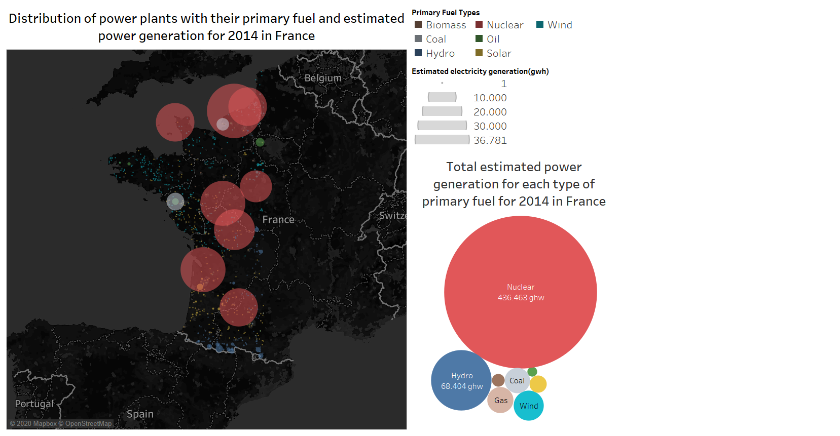
Visual design type : Symbol map and packet buble chart
Name of Tool : Tableau
Country : France
Year : 2014
Visual mappings : For symbol map : Color: the color shows primary fuel types of each power plant in France. Size: the size is based on the estimated power generation of each power plant for 2014 in gigawatt-hours in France. Position: Using longitude for the x-axis, latitude for the y-axis. For the packet bubble chart : Color: the color shows primary fuel types of each power plant in France as the symbol map. Size: The size is based on the total estimated power generation of each power plant for 2014 in gigawatt-hours in France. Label: the label shows the type of primary fuels and their whole estimated power generation for 2014 in France
Unique observation: From this symbol map, we can see that most of the power plants are located in the western part of France. Moreover, nuclear power is the largest source of electricity in France(bubble chart can clearly show and confirm that the estimated power generation of nuclear plants about five times larger than hydro plants for 2014. Also, the red marks in the symbol map represent the nuclear power plants. The size of the red marks is much larger than the other type of primary fuels), and nuclear plants are built on the rivers and oceans(English Channel and Bay of Biscay) because these bodies provide the vast quantities of cooling water needed to handle the heat discharge [1]. Furthermore, France is one of the European Union’s best performers in terms of greenhouse gas (GHG) emissions [1], and this is because nuclear power, which is generated no Co2 emissions, is a significant part of their energy plan. There are two grey circles, which represent coal power plants, in the symbol map, and these are also located near the sea(English Channel and Bay of Biscay) because, in coal power plants, the water is used to create energy [1]. However, there are many wind power plants in the northwest of France. Still, the size of these turquoise circles are very small, so we can say that wind power plants have limited power generation capacity.
Data preperation : I have converted the CSV file to the XSLX file. I have filtered null values in the dataset where applicable. Also, I have filtered country names and have selected only France on the map so I could solely focus on power plants, which is in France. Moreover, I have noticed that nuclear power plants are so important for France, and I have changed the color palette and assign red color to nuclear power plants because the red color is always pre-attentive for people.
My questions :
- Is the choice of colour appropriate for primary fuel types in the symbol map and the buble chart?
- Does my visual design make sense?
- Do you have any suggestions to improve this design?
Thanks in advance.
Sources: Menyah, Kojo, and Yemane Wolde-Rufael. “Energy consumption, pollutant emissions and economic growth in South Africa.” Energy economics 32.6 (2010): 1374-1382.
Dataset link : http://datasets.wri.org/dataset/globalpowerplantdatabase![111|690x358]