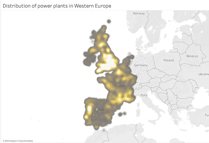
This is a symbol map I have created as part of my University assignment in Data Visualisation, based off a Power Plant dataset linked below. I created a heat-map to show the distribution and possible crowding of power plants within Western Europe:
Guideline:
Visual Design Type: Symbol Map (with density marking)
Name of Tool: Tableau
Country: Western Europe
Year: 2019
Visual Mappings:
X-Axis: AVG(longitude)
Y-Axis: AVG(latitude)
Detail: Power Plant ID (gppd_idnr)
Colour: N/A
Labels: N/A
Unique Observation: It’s observed that the Southern part of the UK leads in possessing the largest density population of power plants. This is closely followed by parts of France and Spain.
Source: http://datasets.wri.org/dataset/globalpowerplantdatabase
Question:
- Are the colours suitable enough and clear to understand?
- The density is so high in the UK that it covers most of the country. Would this be a problem, and should the opacity be lowered further?
- Is there any possible improvements I could make to better aid in understanding the data better?
Thank you!

