
Image
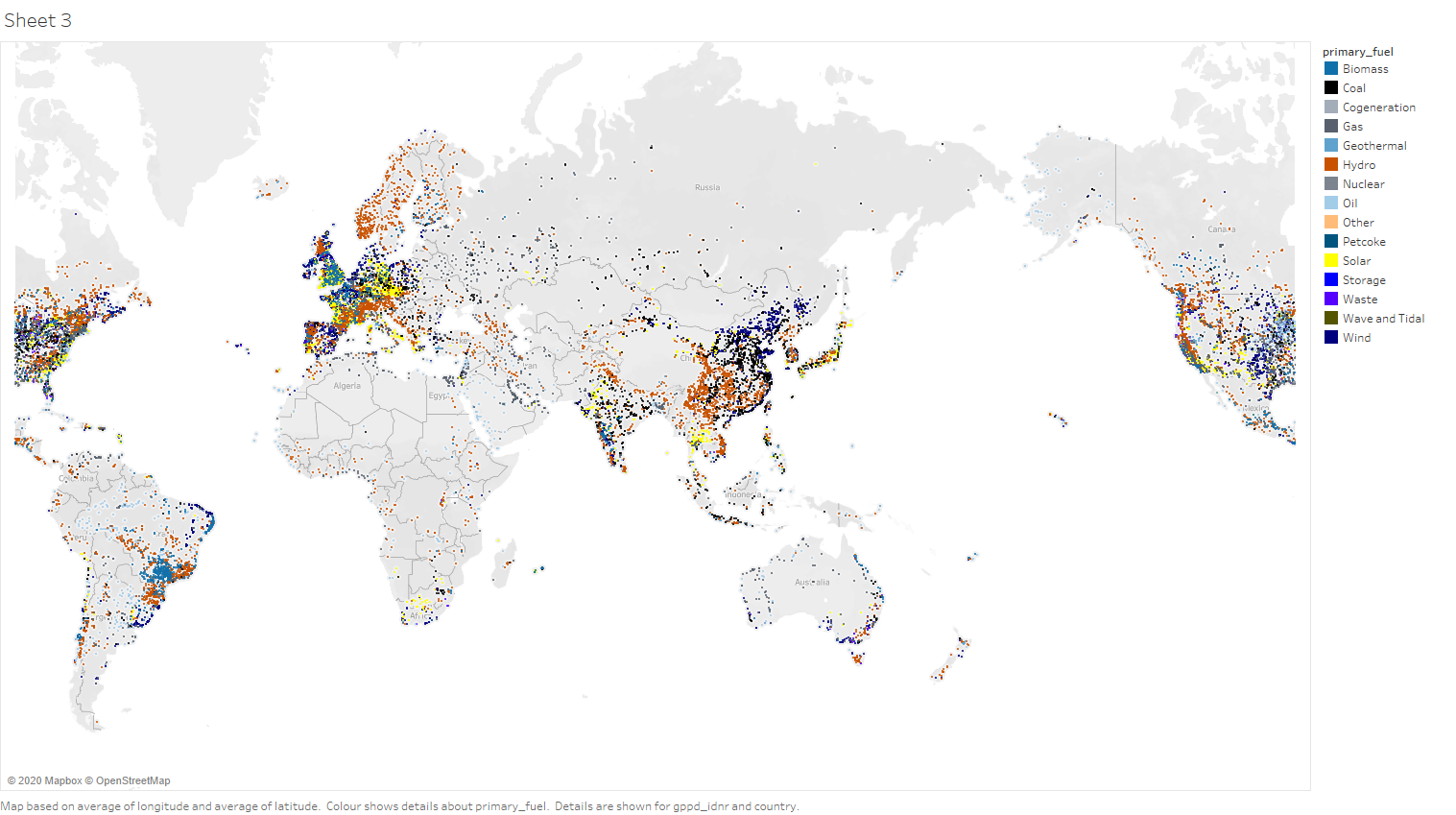
Name of tool : Tableau Student Edition
Country:All countries within the data set
Year : 2017
Visual Design Type : Map
X-Axis, Y-Axis : Latittude, Longtitude
Mark : Circle
Colour : Primary Fuel(Colorblind encoded)
Source: http://datasets.wri.org/dataset/globalpowerplantdatabase
Unique Observations : Countries around Europe seem to have the largest concentration of power plants that use renewable resources.
Solar and hydro powerplants are usually found close to powerplants of the same type.
First world countries have a larger concentration of powerplants.
Powerplants are often found clustered together.
Question:
**I created this visualization with the intent of getting a general feel of the spread of the types of powerplants across the globe. Is there a better visual layout or design I could have used to visualize the information more effectively, or perhaps more information could be convey with certain details on command? I feel like the conclusions that could be drawn from the image is lackluster at best. **