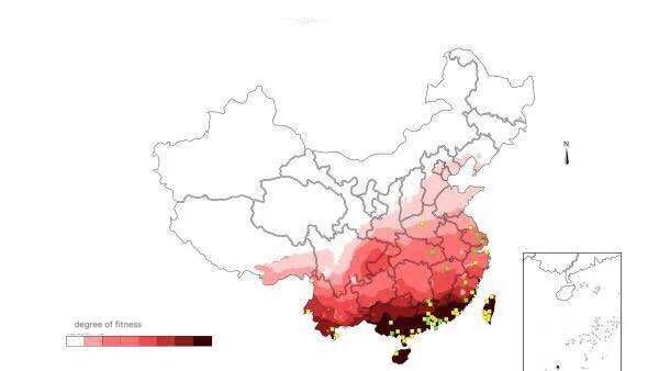
Distribution areas of dengue fever and its vector

Visual design type: digital map

Name of tool: d3.js
Country: China
Disease: dengue
Year: 2014
Visual mapping:
Color: color is mapped to the different incidence rates, the darker the color, the high fitness for its vector.
Scatter plot: the denser the scatter, the greater the number of its vector.
Unique observation: There are many mosquitoes in the south, so the prevalence rate is high.
Data preparation: year, mosquito areas, temperature fitness.

Reference: Z. Geng, R.S. Laramee, F. Loizides, and G. Buchanan. Visual Analysis of Document Triage Data. In International Conference on Information Visualization Theory and Applications(IVAPP), pages 151–163, 2011. (available online).

Question:
Do you think there’s anything need to change about my design?
Please give me your advice.999

It looks good, and there are some suggestions for you :wink:

  1. Please mark the absolute value of the color legend, it is the percentage or number of people? death or affected?
  2. What does the dot mean? Does is present the mosquitoes number? But why it distributed sparsely?
  3. The dot can be suggested to be shown in an aggregated manner, for example, in the province or city level, using the size to encode the number perhaps.

Generally, your design should be related to your goal - which story you want to tell? - Then we can specify the improvement direction for the visualization. For example, if you want to illustrate the relationship of temperature, mosquitoes and the illness - Here is no information about whether / temperature yet.