Hello Guys,
I am a final year computer science student in Swansea and I have a question related to one of the visual representations that I had to build for one of my assignments.
The details are as following:
Year : all years
Visual Mappings:
The Longitude is positioned on the Y axis while the Latitude is positioned on the X Axis.
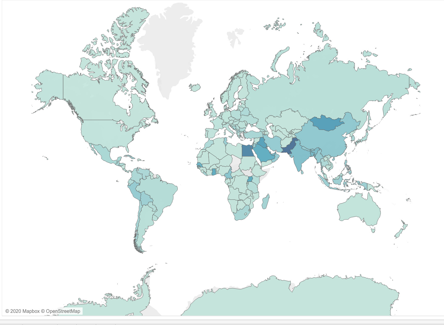
In terms of shape for this particular example there isn’t one.
In terms of colors the mapping is conducted through a gradient descent of blue.
It outlines the pollution index in regards to the countries on the globe.
The higher the level of pollution is the higher the level of the blue color is.
Unique Observation:
Observations in regards to the digital map are the following:
Pollution level is very high is Asia.
Quality of air is very low in South Asia in particular and is behind Europe and North America.
Data Preparation:
In terms of data I have added a new data set that reflects the pollution level on each country, thus the demonstration in the digital map of pollution levels on countries.
In terms of marks I am using all Countries which I am not filtering, in order to observe the distribution of pollution on all countries.
I am using the function AVG for the pollution index in order to depict the average for each country. In this way a gradient descent is obtained that outlines the pollution index for each country.
Is there a better way to express the data in a more appealing color pallet ?
Do the neighboring countries influence the level of pollution in once own country? It would be interesting to observe specific areas of countries to depict if the pollution is coming from the borders of the certain country or if it is simply caused by plants owned domestically.
Looking forward to any reply.
Thank you!