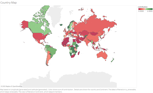
Hi, I am using a dataset of power plants around the world, trying to answer a question of what is the best place for investing into the renewables. Dataset consists of all the major plants in the world, grouped by country, with their respective energy generation and fuel type. Source: (link). What I am missing from this visualization is more information being encoded. Fields like country population or GDP are available to me but I did not know how to include them aesthetically. Is there a way of doing it or maybe combining those features more efficiently?
Something similar was attempted in a paper from 2014: Modeling and visualization of residential sector energy consumption and greenhouse gas emissions by Maija K.Mattinen.
Redirecting.
Description : The map is representing how much each country is dependent on renewable vs non-renewable sources of energy. Greener countries are more ‘green’, and redder are the opposite.
Visual Design Type: Digital Map
Name of Tool: Tableau
Country : All available countries
Year : based on data from the year 2014, this data represents the year 2014.
Visual Mappings:
- position: latitude and longitude of the country.
- hierarchy: separate plants are grouped into their respective countries.
- colour: colour represents continuous field called ‘contribution’, explanation of the field below.
Data Preparation:
- Renewable: United Nations defines renewables as energy that can be replenished at the same rate it is used. This list includes solar, wind, hydro, biomass, tidal and geothermal energy. Discrete field is created with value ‘renewable’ if the plant uses fuel of that type as a primary fuel; ‘non-renewable’ otherwise.
- Contribution: this field denotes the contribution the plant had towards the total energy production of its country. It is calculated through first summing energy generation for each country and then dividing each plants’ generation through that field.
