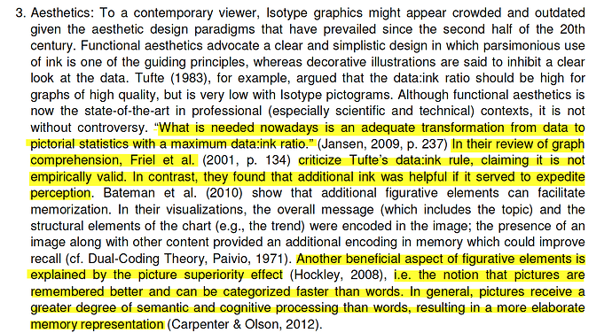
I think we should remove this topic or at least alter it. The phrase “Good visualization should maximize data-ink ratio”* implies that this is actually a rule and that great dataviz could not exist without it. Both are obviously incorrect. Considering we have so many people using a forum like this to learn about rudimentary dataviz, I think it could actually do a disservice to people reading it for the first time.
First off, the data-to-ink ratio is not a rule. A rule implies that you need to do it to be successful. The data-to-ink ratio is an interesting idea by a brilliant person. The fact that Tufte himself says it does not apply to all uses of dataviz just proves my point.
The second problem I have is the “ratio” aspect. This implies a false level of quantitative evaluation. With a concept this vague, how could you prove it?
Another issue is how literal people take this concept and I see comments on this board weighing in on dark-backgrounds. This is not the point, as the idea is about the efficiency of communication, not achieving a good ratio that would equal empirical “success”.
The biggest problem I have with this idea is that it is used as a weapon to discourage creativity and prevent visual exploration. I can not tell you how many times people have weaponized this term to quickly diminish the quality of an interesting chart without even thinking about the audience or the communication objectives.
Edward Tufte is brilliant and played a significant role in the widespread appreciation of dataviz - let’s not take his good ideas and use them to bad effect.
Lastly, this concept has been invalidated by visual researchers on quite a few research papers:
