Data-Ink Ratio Principle, How to use it?

Guideline: Good visualization should maximize data-ink ratio
Source: Edward R Tufte, The Visual Display of Quantitative Information, Graphics Press, 1983.

I have some difficulties to follow this guideline and need some advice. On a computer screen, white colors use more energy. In a bar chart, if I use a black or colored background, do I use less non-data-ink than the white background? If I use wider bars, do I use more data-ink than narrow bars? If I use a dot to represent the top of each bar, so I use less data-ink than bars?

Tufte himself acknoweledges that the rule has limitations:

“The principle makes good sense and generates reasonable graphical advice-for perhaps two-thirds of all statistical graphics. For the others, the ratio is ill-defined or is just not appropriate. Most important, however, is that other principles bearing on graphical design follow from the idea of maximizing the share of data-ink.”
(Visual Display of Quantitative Information, Chapter 4).

Given this, and the examples that Tufte presents, I think that spirit of the rule is best captured by intrepreting “ink” as “graphical elements”, and treating the rule as an suggestion to remove unnecessary elements (or parts of elements) from graphics, just as Strunk and White advise writers to “omit needless words”.

I don’t think that the ratio is necessarily useful as a quantitive measure, though I think that other quality metrics can be.

Interestingly, Tufte does refer to Strunk and White in VDQI, but only as a source for the quotation “No one can write decently who is distrustful of the reader’s intelligence, or whose attitude is patronizing”.

Thanks to OLED and “dark-mode” being trending, I’ll bump this posting back up! :grin:

On OLED displays using dark-mode lowers the energy consumption.1 Beside the personal preference this is the reason, why the dark-mode and dark themes for websites are becoming more common. This means, that if we want to display visualizations on such websites, we should consider it being “dark-mode-friendly”.

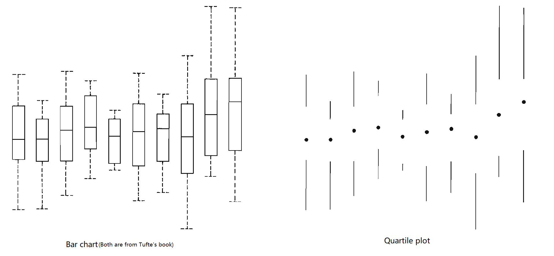
If we still want to follow the “Data-Ink Ratio Principle”, we simply switch black and white in our calculations.

The word “ink” seems to be outdated for todays use and I agree with @jamescottbrown that we should use “graphical elements” instead.

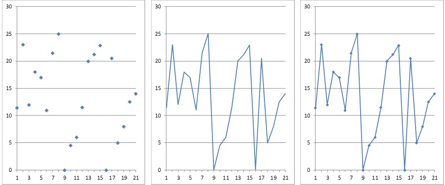
Personally I dislike visualizations with high data-ink ratio, since they get “boring” to look at. It seems that this isn’t only true to me, since Inbar did an experiment on students, that report the same preferences as me.2

Humans like beautiful things, studies show, that our well-being improves, when we look at beautiful things. Less boring things increases our attention.3

So what should we call “chartjunk”? For me chartjunk is everything that takes the locus of attention away from the data or/and obscures it.

So instead of using quality metrics, in this case it would make more sense to discuss your result with the target users.4

As conclusion, please be creative by designing visualizations!

Sources

1:
https://www.howtogeek.com/407860/heres-when-a-dark-theme-can-save-battery-power/

2:
Ihad Inbar, Noam Tractinsky and Joachim Meyer. Minimalism in information visualization: attitudes towards maximizing the data-ink ratio. http://portal.acm.org/citation.cfm?id=1362587.

3:
https://youtu.be/-O5kNPlUV7w by Kurzgesagt, they create beautiful videos with a lot visualizations in it.
I recommend watching the whole video, but the important part starts at 4mins.

4:
“Evaluating visualizations” slides page 29 by Chat Wacharamanotham from University of Zurich.

I would argue that Tufte’s data-ink ratio guideline is not concerned with literally saving ink. For that reason, it is valid on screen to the same amount as it is on paper, regardless of the display technology and its energy consumption.

The essence of the guideline is that “non-data-ink or redundant data-ink” (Tufte 1983), i.e., visual elements which do not convey any information at all or no additional information, should be removed. In Tufte’s terms, these elements are “chartjunk”.

However, due to the ink metaphor, Tufte’s guideline implicitly promotes black color on white background. This is not appropriate anymore. An inversion of contrast, as with the dark mode mentioned by JarVIS, is common nowadays and there is nothing wrong with it.

This leads me to another point. Beyond the topic of foreground-background contrast, the guideline also misses to account for color use in a graphic. Color use has no impact on the data-ink ratio as defined by Tufte. However, meaningless use of color clearly produces “chartchunk”. On the other hand, conscious use of color can reduce the number of elements in a graphic (e.g. coloring of data points instead of labeling them).
In a paper about practical rules for using color, Stephen Few (2008) gives the following rules, among others:
Rule #3: “Use color only when needed to serve a particular communication goal.”
Rule #4: “Use different colors only when they correspond to differences of meaning in the data.”
Rule #7: “Non-data components of tables and graphs should be displayed just visibly enough to perform their role, but no more so, for excessive salience could cause them to distract attention from the data.”
In a way, these rules can be seen as the equivalents for color use to the data-ink ratio guideline. At least, they convey a similar idea: color should only represent the data, and different colors should represent differences in the data.
Again, the limitations in Tufte’s guideline stem from the fact that he uses the ink metaphor. Perhaps the guideline could benefit from a slight reformulation replacing the ink metaphor with something more appropriate?


References:
Stephen Few. 2008. Practical Rules for Using Color in Charts.
Edward R. Tufte. 1983. The Visual Display of Quantitative Information. Graphics Press.

Since there are many replies about the definition of ‘data-ink’ (I fully agree with the new definition of ‘ink’ due to the computer using in our daily life), I want to focus on your question.

I find that compared to the white background, dark one tends to give us an ‘Immersion Feeling’, that means, it can help readers to focus more on the content in a graph. (Mentioned in Juile Steele’s book) This may meet Tufte’s idea to some extent, so I think a black background reduces non-data-ink. As for the colored background, it depends on different conditions. For example, if you try to use a multi-color background, I believe that it fails to decrease the ‘non-redundant ink’ and may confuse the readers. And if you try to use a solid color background to match the theme of your graph (Eg blue background and white bar to represent
remaining Glacier in the world), I think it is a beautiful graph to deliver your point but have nothing to do with the ‘data-ink’ …

For the width, I consider it also has nothing with ‘data-ink’. As the above three users say, ‘data-ink ratio’ is meaningless as a quantitive measure. Let’s imagine, if we adjust a narrow bar to a wider one , does that mean the non-erasable core of a graph increase? I do not think so. The core part is the same in the two graphs.

Additionally, for the dots’ question, you are right, from my point of view. This is also proven by Tufte in his book (Chapter 6). He simplifies the bar chart into a new form, quartile plot, without loss of information but an increase in data-ink ratio. I show them in the following picture.


However, I also argue for the beauty of the new quartile plot … I absolutely fail to admit it better than the bar chart. As far as I say, the quartile plot focuses more on the first and last quartile and ignores the second and third one (the two major ones), because it uses blank in the middle. It gives readers a misleading view.

Reference:

  1. Juile Steele, Noah Iliinsky, etc. 2010. Beautiful Visualization. O’Reilly Media.
  2. Edward R. Tufte. 1983. The Visual Display of Quantitative Information. Graphics Press.

I agree that ink itself is no longer a major cost to a visual representation. However, the amount of ink can be related to cognitive load. I am not sure if this was part of Tufte’s consideration. For example, the ink for embellishment may cause distraction, and the amount of ink may correlate to the amount of cluttering (thus confusion).

Nevertheless, the correlation is not always in the same direction. Too little ink can also incur more cognitive load. Comparing the two charts in the previous post, the quartile plot would require more cognitive load to perceive some information that is not explicitly display. It is slightly easy to compare the relative position of two horizontal line segments than two dots. I often use the following three plots as prompts in my lectures for students to discuss the data-ink-ratio. Note that each line segment is uniquely defined by its two endpoints. Hence the ink for the lines is redundant. I ask students “are these lines useful in the 2nd plot? Are the markers useful in the 3rd?”

I think we should remove this topic or at least alter it. The phrase “Good visualization should maximize data-ink ratio”* implies that this is actually a rule and that great dataviz could not exist without it. Both are obviously incorrect. Considering we have so many people using a forum like this to learn about rudimentary dataviz, I think it could actually do a disservice to people reading it for the first time.

First off, the data-to-ink ratio is not a rule. A rule implies that you need to do it to be successful. The data-to-ink ratio is an interesting idea by a brilliant person. The fact that Tufte himself says it does not apply to all uses of dataviz just proves my point.

The second problem I have is the “ratio” aspect. This implies a false level of quantitative evaluation. With a concept this vague, how could you prove it?

Another issue is how literal people take this concept and I see comments on this board weighing in on dark-backgrounds. This is not the point, as the idea is about the efficiency of communication, not achieving a good ratio that would equal empirical “success”.

The biggest problem I have with this idea is that it is used as a weapon to discourage creativity and prevent visual exploration. I can not tell you how many times people have weaponized this term to quickly diminish the quality of an interesting chart without even thinking about the audience or the communication objectives.

Edward Tufte is brilliant and played a significant role in the widespread appreciation of dataviz - let’s not take his good ideas and use them to bad effect.

Lastly, this concept has been invalidated by visual researchers on quite a few research papers: