
Hello,
I created a stacked bar chart to show the countries with the least amount of power generated (in gwh), which also shows the percentage of what different fuel types generates for each country, and I am uncertain about how I should further approach designing this visualisation.
Thanks in advance : D
Image:
Dataset Source: http://datasets.wri.org/dataset/globalpowerplantdatabase
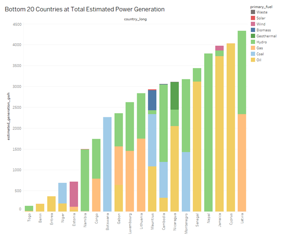
Visual Design Type: Stacked Bar Chart
Name of Tool: Tableau
Country: All (Filtered to show the bottom 20 countries at power generation)
Year: 2013-2017 Estimated
Visual Mappings:
• Stacked Bar Chart:
X-Axis: country_long
Y-Axis: SUM(estimated_generation_gwh)
Marks: Bar
Colour: primary_fuel (Automatic palette)
Filters: country_long>Top>By Field>Bottom 50 by estimated_generation_gwh Sum;
SUM(estimated_generation_gwh)>Special>Non-Null Values
Sort: estimated_generation_gwh ascending
Unique Observations:
Togo is the country with least amount of estimated power generated, most of which is generated via hydropower.
It is then followed up by Benin and Eritrea as second and third countries with the smallest power generation respectively, and they solely rely on oil for power generation.
Power generation in Botswana is entirely dependent on coal as primary fuel, and Nepal only uses hydropower.
Cyprus seems to be the highest generating country out of the 20 that only rely on one primary fuel, which is Oil.
Oil and hydropower seems to be the most used primary fuels between these 20 countries.
Data Preparation:
Filters applied to Stacked bar chart to remove null values and restrict the amount of countries shown.
Questions:
Would this visualization benefit from implementing additional visualizations, or is it clear enough and present enough insightful information?
Since the purpose of the visualization is to show some of the countries with the smallest total power generation, is it ok to restrict it to 20 countries or would the visualization benefit from showing all countries in ascending order of power generation?
There are about 69 countries that have null values for ‘estimated_generation_gwh’ (and have been filtered off from the visualization), would not knowing if these countries could have lower power generations than what is known invalidate the visualization?
For some countries, the generation of some fuel types is 0, should values below 1 be filtered to remove irrelevant data from the visualization?