
Hello,
I am a student at Swansea university who is studying computer science. For a data visualisation module I have been asked to produce some visualisations based on the Global Power Plant Database. The visualisation is shown below
Thank you for your time
Details:
-
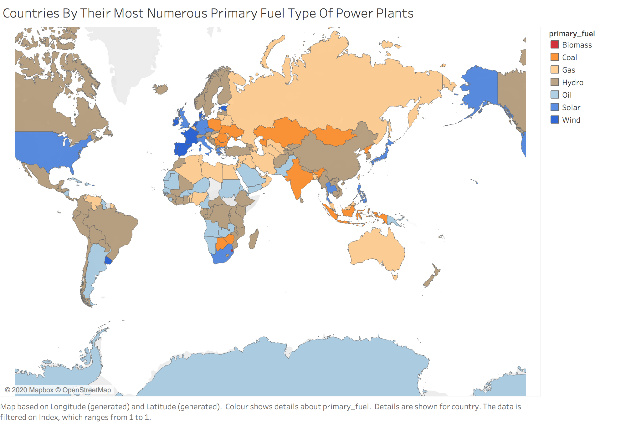
Visual Design Type: Map
-
Name Of Tool: Tableau
-
Country: Global
-
Year: All years in the database
-
Visual Mapping:
Colour: Indicates primary fuel type
X-Axis: Longitude
Y-Axis: Latitude -
Observation: From this visualisation we can see each countries most numerous primary fuel type i.e the fuel type used by most of its plants.
-
Data Preparation:
The database was loaded into tableau as a csv file.
An index was calculated & used to order countries by their most numerous primary fuel type.
The countries were then filtered to only include their most numerous fuel type.
Source: http://datasets.wri.org/dataset/globalpowerplantdatabase
Questions:
- Does the visual design make sense?:
- Is my choice of colour ideal?:
- How can the visual design be improved?:
- Are there any other types of visualisations that would be better for this purpose?: