Hi everyone,
I’ve got a quick side-by-side stacked bar chart here that I’d like an opinion on. I retrieved the data from Project Tycho to work on for an assignment on information visualisation. A brief description of how I compiled the visualisation follows.
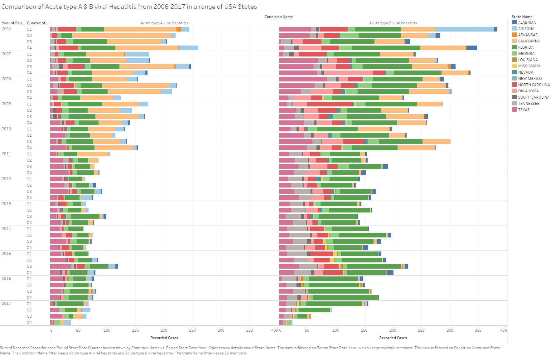
DOI: 10.25337/T7/ptycho.v2.0/US.25102003
Visual Design:
Side-by-side stacked bar chart.
Name of Tool:
Tableau was used to generate this image.
Country:
The data is for fifteen different states from the United States of America.
Disease:
The diseases shown are acute viral hepatitis, both type A and type B.
Year:
The data recorded is from quarter 1 2006 to quarter 4 2017.
Visual Mappings:
The data is mapped to two different stacked bar charts based on disease. An individual colour has been assigned to each of the represented states, and can be seen on the key to the right. The size of the bar is the total count of recorded cases, as shown on the ‘x’ axis, during a single quarter of a single year, as shown on the ‘y’ axis.
Observation:
We can observe from this that there has been an overall decline in recorded cases of both acute hepatitis type A & B. Hepatitis B has a much faster decline than hepatitis A, however, we must also make note of the fact that due to the lack of recorded cases in California that the data set itself might not be complete.
Data Preparation:
The data was acquired from the Project Tycho site and imported to Tableau without alteration. Within Tableau I altered the headings of several fields to improve readability.
Reference Material:
Tableau Tutorial – Learn Data Visualization Using Tableau by Reshma Ahmed, published on Dec 24,2018: Tableau Tutorial for Beginners and Experienced in 2025
Tableau Data Visualization Cookbook by Ashutosh Nandeshwar, published by Packt Publishing Ltd, 2013.
Question:
Does the graph show a good trend to support my observation?
Or does the lack of Californian data later in the decade pose a problem?
Do you have any suggestion on what I could add to display the information clearer?