
Guideline
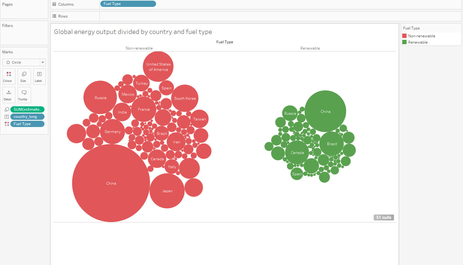
Visual Design Type: Bubble Chart
Name of Tool: Tableau
Visual Mappings:
colour: red for unrenewable fuel source and green for renewable.
size: estimated power generated for a particular country.
label: country name.
Unique Observation: Most of the worlds energy comes from unrenewable fuel sources.
Data Preparation: Data is grouped by fuel type into renewable and unrenewable categories.
Source: http://datasets.wri.org/dataset/globalpowerplantdatabase
Question:
Does my visualisation make sense? Is the meaning of the size clear? Is there a better way of presenting a comparison of renewable/non-renewable power sources between countries?