
Guideline: Insert the visualization guideline
Source: https://www.tycho.pitt.edu/search/
Question:
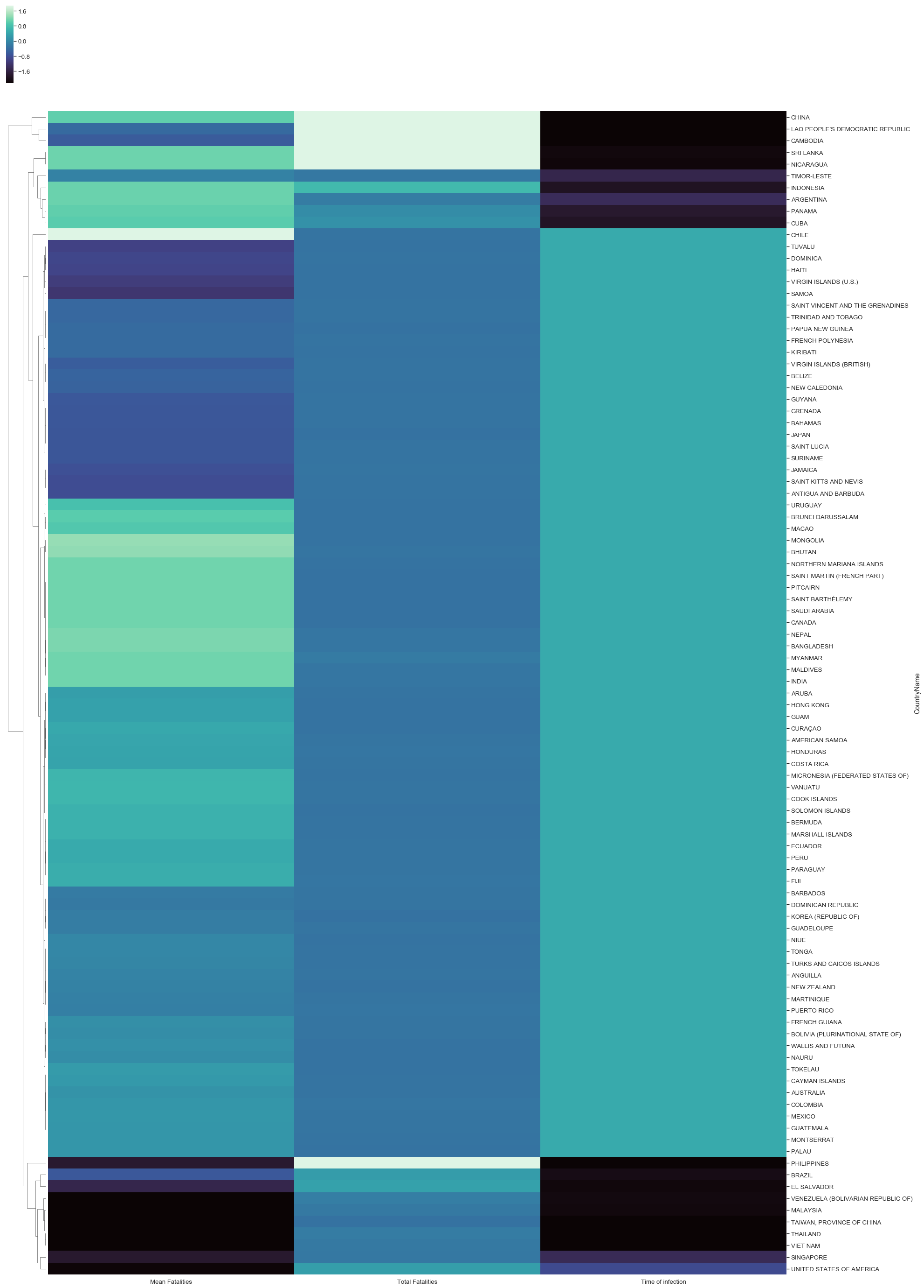
I am a student at Swansea University. I am currently working on an assignment which consists in the implementation of a visualisation of data obtained throught Project Tycho (https://www.tycho.pitt.edu/). For this assignment, I have chosen to represent the correlation between the total number of fatalities, the average number of fatalities ( against the number of records) and the time of infection for Dengue virus. This was done for 99 different countries
It would be very grateful if someone could bring some recommendations or any comments.
These are the information concerning the visualisation :
- Visual Design Type: Cluster Heatmap
- Name of the Tool: Python
- Country: 99 different countries
- Year: 1924-2017
- Visual Mappings:
- Color: The values in each column are standardized, color is mapped to the difference to the mean (mean of each column). Each row represents a country.
- Hierarchy: At the left, the hierarchy represents the different clusters created by the average method.
- Unique Observation: We can clearly see that for China, Cambodia or Nicaragua, the total number of fatalities is very high comparing with the mean of all countries. The mean fatalities which represent the ratio between the number of total fatalities and the number of records, these countries are just above the mean of all countries. Indeed, Chile has the highest mean of fatalities which means that the majority of infected people died. It is also important to underline that for Brazil, Venezuela, Taiwan, Thailand or Vietnam, the time of infection is relatively short and it seems that the mean fatalities has the same trend.
- Data preparation: In order to have the mean of fatalities for each country, the data has to be grouped by country and sum the total of fatalities for each countries divided by the number of records. Concerning the time of infection, it is the difference between the start date and the end date. To have clearer plot, it was also necessary to standardize the data.
The DOI of the dataset :
https://www.tycho.pitt.edu/search/
All the countries was selected and in “Condition”, “Denge” was also selected
Thank you.