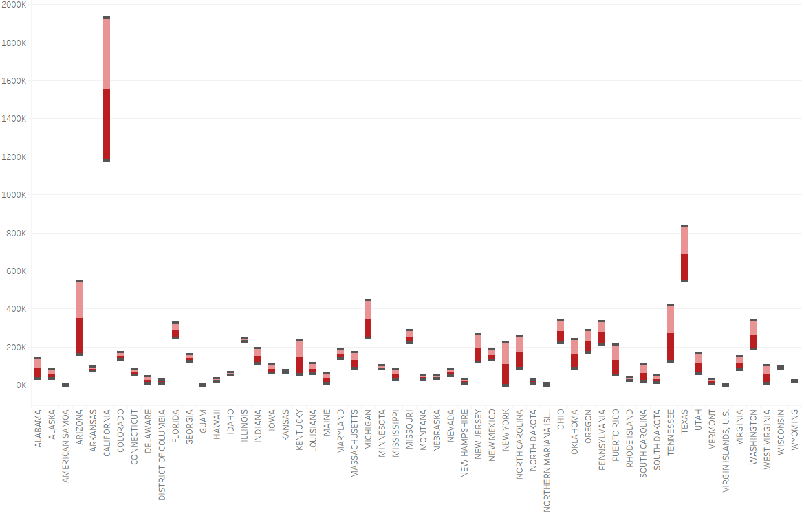
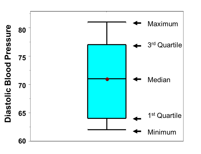
I am a Student in Swansea University, currently trying to complete a Data Visualisation Assignment using the information from Project Tycho (https://www.tycho.pitt.edu/). Knowing that many people are diagnosed with Hepatitis A and Hepatitis B, I was intrigued to see the number of cases that exist in the United States of America and compare them. To display the data is used a ‘Box-and-Whisker’ plot, showing both diseases along with their cases in the time period of 1952-2001.
Light Red = Viral Hepatitis, Type A . Dark Red = Viral Hepatitis, Type B.
Visual Design Type: Box-and-Whisker Plot.
Name of Tool: Tableau.
Country: United States of America.
Disease: Viral Hepatitis, Type A and Viral Hepatitis, Type B.
Year: 1952 - 2001.
Visual Mappings:
- Colour – Each disease has a different colour that is present in the States.
- Size – The size of each coloured section representing the two diseases is allocated to the number of cases that were reported in those states in the time-span.
Unique Observation: From this visualization the cases of both diseases are nearly identical for each state in the time-span, meaning there is no comparison that can be depicted. However, from this visualization we can see that the State of California has the highest cases of both diseases by a very large margin.
Data Preparation: To gain this visualization, each spreadsheet that contained the information of the diseases had to be appended to each other. Also, irrelevant rows and columns were removed.
Viral Hepatitis A - DOI - 10.25337/T7/ptycho.v2.0/US.40468003
Viral Hepatitis B - DOI - 10.25337/T7/ptycho.v2.0/US.66071002
If anyone would not mind in giving feedback and answering some questions I have, it would be greatly appreciated.
-
Is there a better way to display 2 diseases, their cases and the States they exist in? I tried looking for more visualisations but i could only come across this one.
-
Should I include if fatalities occurred in the given states along with the cases?
Thank you.


