
Hello! I am trying to create a map which shows all power plants in China and colour code them by it’s commission date. Each decade has a different stepped colour from dark red to dark blue. Some might be missing as some of the power plants were missing commission dates from the data set.
Visulization:
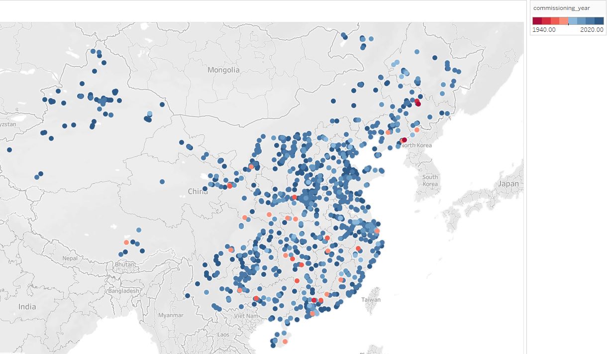
Visual Design Type: Map
Name of Tool: Tableau
Country: China
Year: All Available
Visual Mappings:
- The columns and rows are made up of the longitude and latitude in order to create the map.
- The points show each power plant with an available commissioning year.
- The colours indicate the decade the power plant was commissioned, starting from dark red in the 1940’s to dark blue in the 2020.
- The fuel types used is also available when a point is hovered over with the mouse.
Unique Observation:
The purpose of this visualization is to show all the power plants in China along with the year they were commissioned. A lot of the power plants were commissioned between 2000 and 2020. The power plants commissioned between 1960 and 1980 are relatively spread out.
Data Preparation:
I needed to filter out the rest of the countries in order to compile all of China’s data.
Source: http://datasets.wri.org/dataset/globalpowerplantdatabase
I am unsure whether this is the best way to visualize the data so I would like some pointers like whether the colour palette is the okay and how I should represent the fuel type each power plant uses without the need of hovering over the point.
Although you can zoom in to see each point clearer, from the initial image a lot of points are clustered together so it is difficult to spot individual ones. Is there a better way to visualize these points so it is easier to see with the default scale?
If anything else sticks out please do not hesitate to tell me.
Thank you in advance and all criticisms are welcome!