Hello everyone,
I have designed a visualisation with data from Global Power Plant Database. Would you mind giving your recommendation?
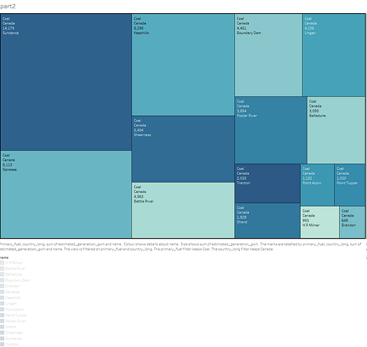
Image:
Visual Design Type : density map + bar chart
Name of Tool : Tableau
Country : Canada
Year: 1980–2018
Visual Mappings:shape:square, colour: blue-teal
Hierarchy:name, primary fuel,sum(estimated_generation_gwh)
Color : Different values of estimated_generation_gwh.
Unique Observation: My treemap indicate that Canada’s name point use of coal as well as the number of their names. Through the square of the size and color can know estimated_generation_gwh.
Data Preparation: Data is only from the filtered country..
Web Source : http://datasets.wri.org/dataset/globalpowerplantdatabase
My Question :
• Does my visual design make sense?
• How can my visual design be improved?
