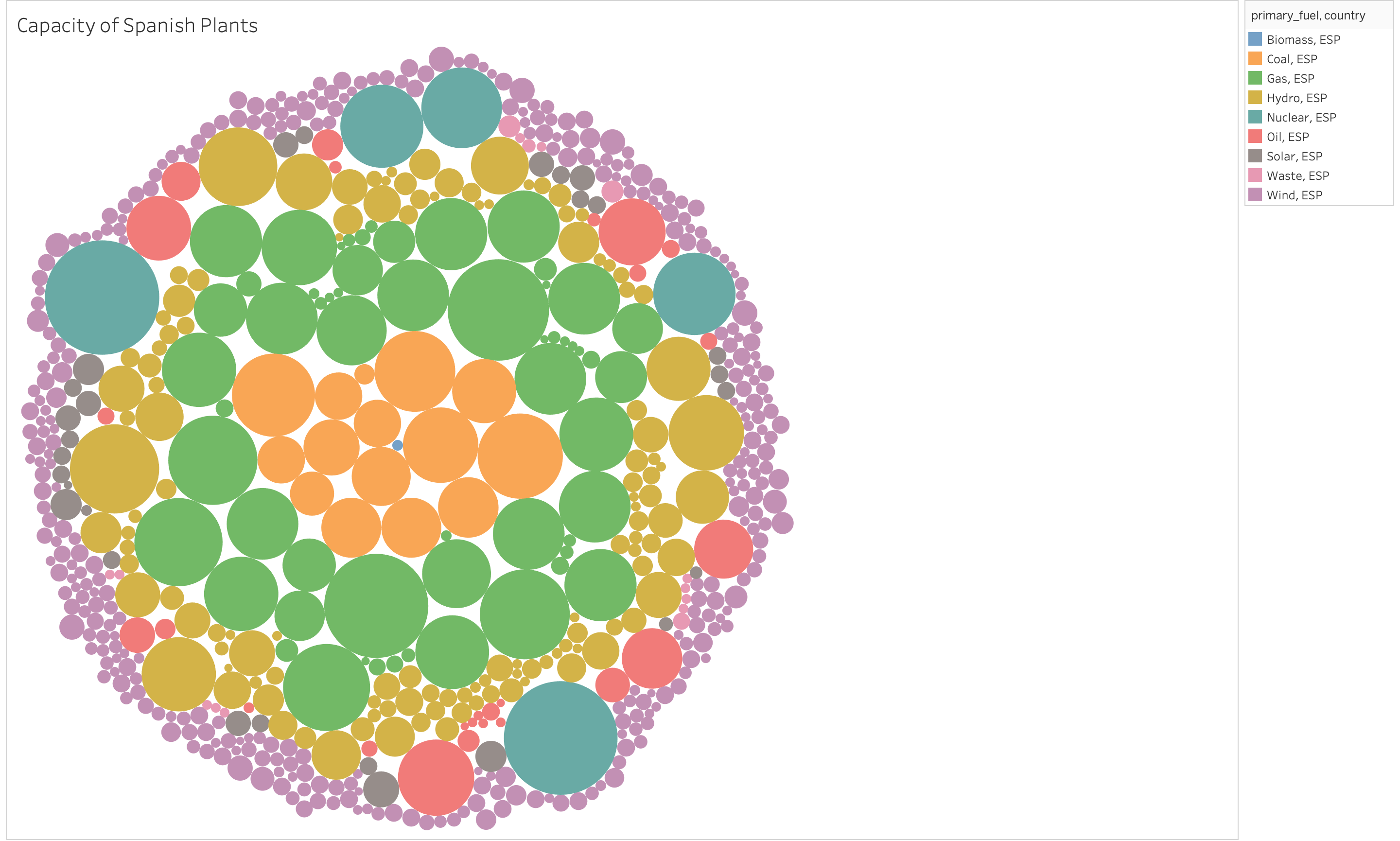
Overall, the Visualisation is a good idea, but some alterations can be made. I understand that you’ve filtered the data to show each power plant and what it produces. But, the visualisation doesn’t quite match the data. It may have been better to produce a packed bubble diagram of the count of power plants in Spain producing each fuel type.
The colour scheme could also be altered for example, with colours matching the fuel type slightly more. Say for example, Hydro being blue, oil being brown/yellow, coal being black etc.
Is this understandable or does it need more information?
=> Sorry, it took so long time to understand your graph. It is not understandable. Thus, It is difficult to read for someone who isn’t already familiar with that type of data visualization. Why don’t you use a bar chart? I think the packed bubble is unnecessary and Chart Junk. The bubble is pretty but makes the chart complicated and hard to read information. A bar chart is simple. This simplicity makes a bar graph a good choice when you’re trying to get your data across to large groups of people. you can find more details from Difference Between a Bar Graph & Pie Chart (sciencing.com)
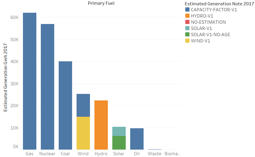
I made a bar chart with your data. It is more obvious to show what you want to represent on visualization.
Is this understandable or does it need more information?
I don’t think that your visualisation needs more data, but rather a different method to display the current data. This is because of two reasons:
The first reason is an addition to the answer of @cco. The human brain is better at comparing lengths than areas as many scientists have shown. Take a look at this link, where they talk about this: The Science Of Visualisation
Because of this I would recommend you change this accordingly, such that the viewer can better compare the individual data points.
The second thing I thought was worth mentioning, is the fact that you used nine different colors in your visualisation. I almost did not notice the small blue dot in the middle and I think there are ways in which you could improve this.
As a guideline which could help you, it is recommended to only use about six different colors in a visualization. The Do’s and Don’ts of Chart Making
They say “Too many colors means similar hues will appear, like blue and green, which can be difficult to tell apart. Also, the paler a color is, the harder it is to see. Too many colors is like having too much data. It is confusing and distracting”.
This exactly happens in your visualisation, the viewer cant properly differentiate between the data “Waste” and “Wind”.