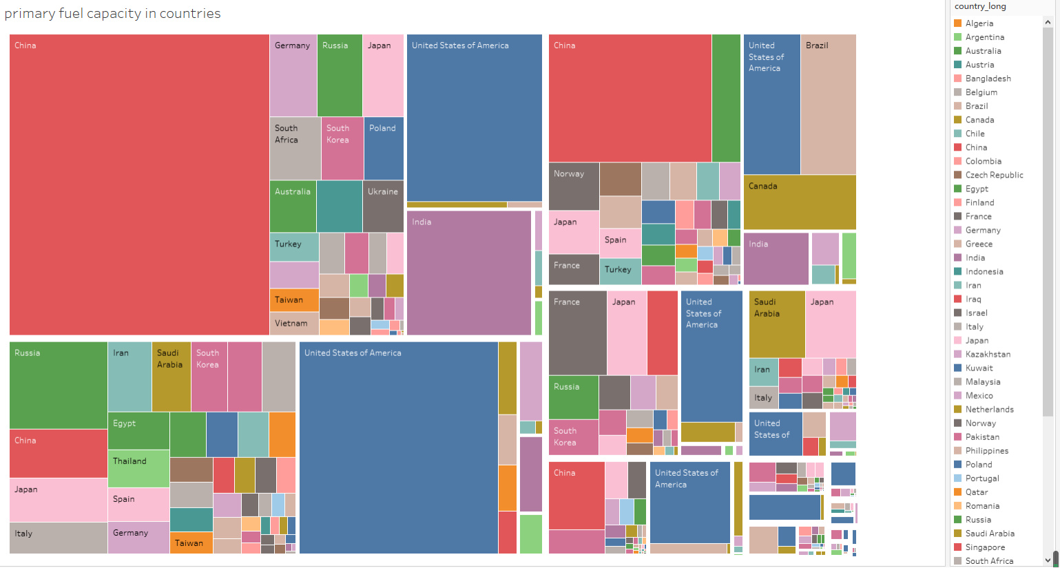
Visual Design Type: Tree Map
Name of Tool: Tableau
Country: All countries from the source
Year: 2010-2018
Visual Mappings: This tree map shows the capacities of fuels and the generation of fuels from 2010 to 2018. Each color represents a country. The quite bigger gap splits different fuels. The larger a square is, the bigger the value is.
Unique Observation: the United States of America has the most or second-most capacity of all types of fuels. China has the biggest capacity of coal fuel with an unknown capacity year.
Data Preparation: Each country has its color. Different fuels are split into different areas.
Question:
1.It may be a bit messy. Is it reasonable as a visual design?
2.Is it necessary to improve and how could I improve?
Don’t hesitate to give me a little lesson if u can, pls. Thx.