Hi,
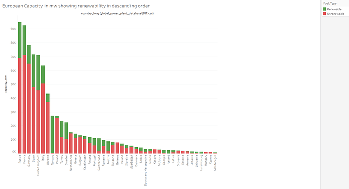
I am currently learning Data Visualisation techniques through my Computer Science course at Swansea University and have been tasked with creating some visualisations and getting feedback on them, below is one of my creations. It is a stacked bar that depicts the amount of renewable vs unrenewable capacity in European countries.
Image:
Source: Global Power Plant Database - Datasets - WRI ODP
Visual Design Type : Stacked bars
Name of Tool : Tableau
Country : European Countries
Year : N/A
Visual Mappings:
Column is Country name and Row is Capacity in MW
Colour is the fuel type (Custom column I made – Renewable or Unrenewable)
Unique Observation : We see a common trend with the top 5 or so countries where a large majority of capacity comes from unrenewable plants, however, Norway breaks this trend with a massive majority from Renewable and many smaller countries follow this such as Austria, Iceland, Luxembourg, and Sweden with many more having interesting proportions.
Data Preparation : Filtered countries to Europe, Fuel type is a column I made in the excel spreadsheet by using an if statement and the primary fuel to categorise it into Renewable or Unrenewable.
Question:
Is it useful to see the simple breakdown of Renewable vs Unrenewable or would you rather see the more complex breakdown of the many individual types of fuel used, even if it affects aesthetics and readability negatively?
Thanks for reading and anyone feel free to answer my question as I’m curious about the readability vs complexity tradeoff.
