Hi, I’m currently studying Data Visualisation at Swansea University and have produced a representation of the Global Power Plant Database data set, this bullet graph shows the use of unrenewable energy sources, globally, before and after the Paris Agreement in 2016
Image:
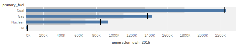
Visual Design Type: Bullet Graph
Name of Tool: Tableau Desktop
Country: All
Year: 2015 and 2017
Visual Mapping: The black bars on the bullet graph depict the amount of gwh produced in 2017 from each fuel source whereas the blue bars depict the amount of gwh produced in 2015 by the same fuel sources.
X Axis: Generation of GWH in 2015
Y Axis: Primary Fuel
Observation: From the bullet graph we can see that overall since the Paris Agreement, the amount of power generated by the main unrenewable resources such as fossil fuels like coal, gas etc have on average decreased, with the exception of oil which has seen a slight increase in it’s use to generate power.
**Source: ** Global Power Plant Database - Datasets - WRI ODP
Questions:
- Does the visualisation depict the data clearly and efficiently?
- If you were to visualise this data, what technique would you use?
- Any overall improvements to the bullet chart?
Thank you