
Hi everyone,
I’m a 3rd year Computer Science student at Swansea University and I am completing an assignment
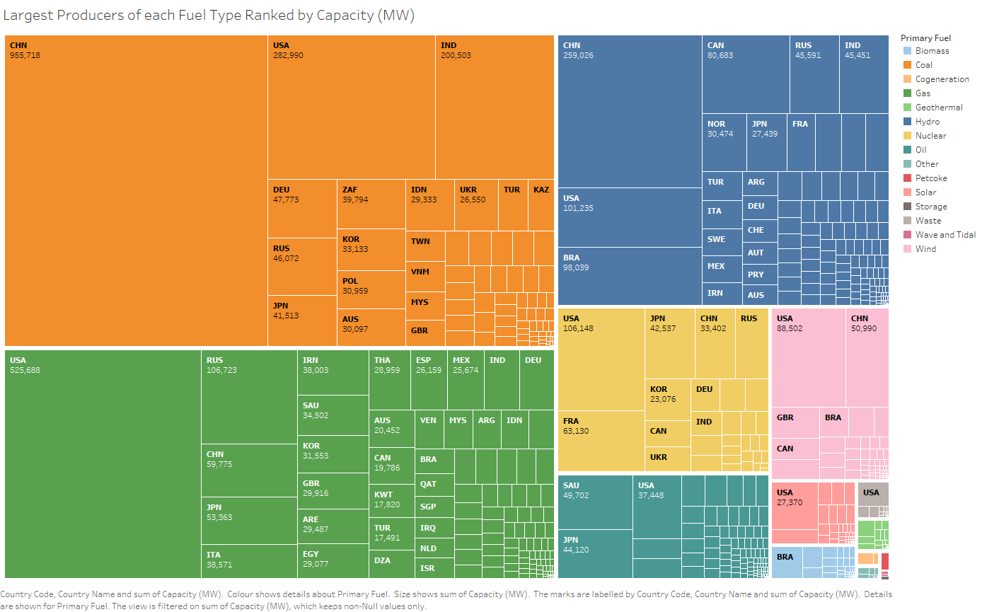
to analyse and produce visualisations for a global power plant dataset. One of my graphs is a tree map representing the portion of worldwide power capacity of each fuel source. This is then further split
into each country’s capacity contribution using the fuel source.
The size of every node + leaf node is relative to the percentage of worldwide / fuel source capacity that the country / fuel source makes up.
The tool used to create this visualisation is Tableau Professional Edition.
The visualisation uses every data entry with a non-null value for Capacity.
To accomplish this, I calculated the sum of all capacities for each fuel type and mapped the size of each
noce to this.
Visualisation:
Reference Material: Squarified Treemaps by M Bruls, K Huizing, JJ Van Wijk (2000)
Question:
How would you rate the readability of the graph and are there any improvements I could make / better graphs I could use to represent worldwide power capacity contributions by fuel source and country?
Am I perhaps including too many countries causing clutter?
Data Set Used: http://datasets.wri.org/dataset/globalpowerplantdatabase
Thank you tons for reading this, any ideas/sugestions are welcome!
Scott