
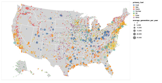
Visual Design Type:
: Digital Map
Name of Tool:
: Altair-viz / Python
Country:
: USA
Year:
: 2013-2017
Visual Mappings:
: * mapping 1: Colour maps to the primary fuel used by the plant.
: * mapping 2: Size maps to the average generation of the plant by year.
: * mapping 3: x-position corresponds to longitude.
: * mapping 4: y-position corresponds to latitude.
Data Preparation:
: For the dataset 5000 plants were chosen, located in the USA. Furthermore, the data was cleaned by removing missing values and filtering plants that use less “popular” fuels. Additionally, for each plant in the resulting dataset the average of the yearly production across the 4 years was taken (missing values - if any, were omitted in taking the mean).
Link to dataset: http://datasets.wri.org/dataset/globalpowerplantdatabase
Question:
: * I was wondering whether the design is clear enough or should I aggregate some of the plants given the number of them.