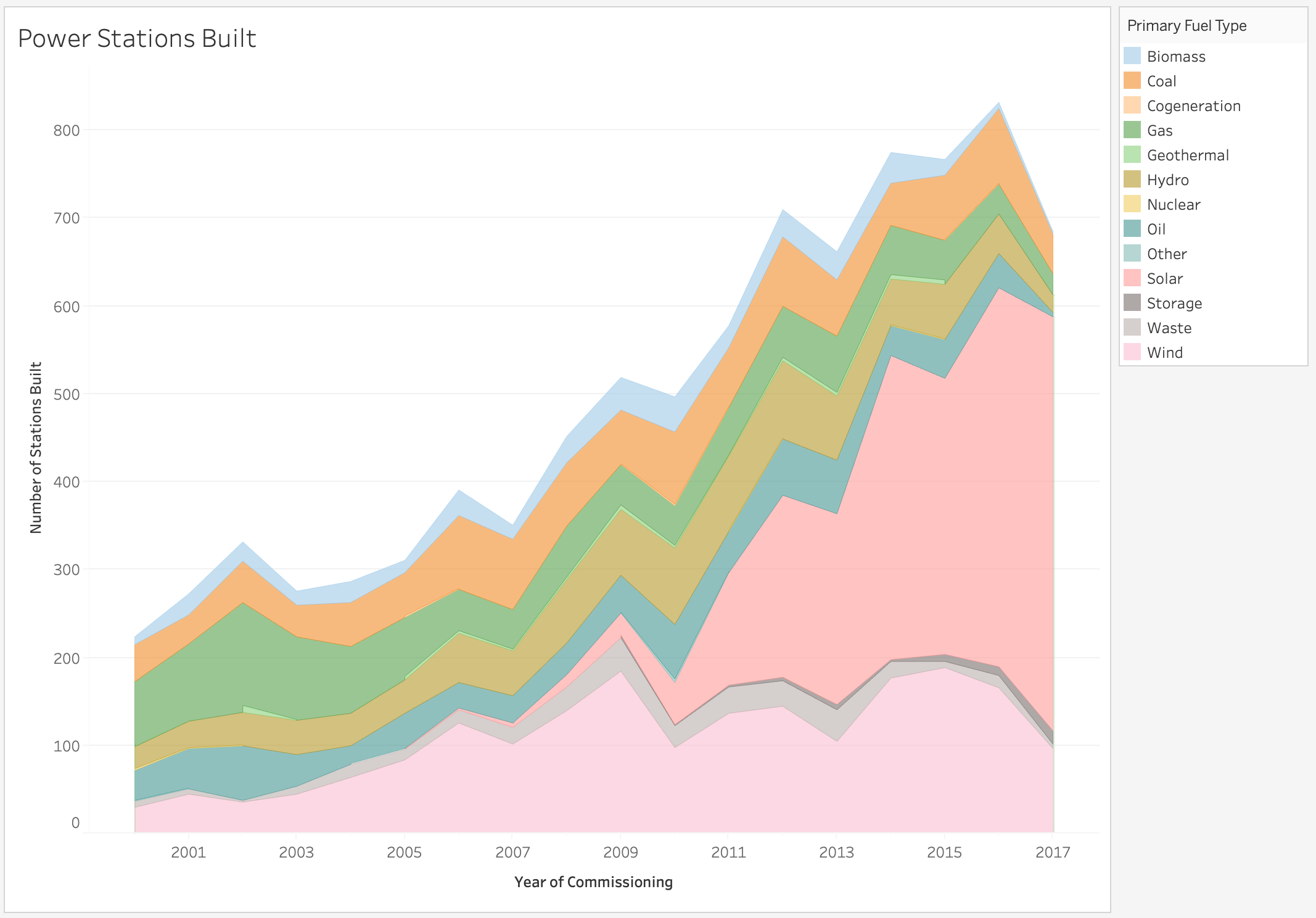
Hey everyone, I just wanted to know what you think about this graph i created to try and work out if all this talk about going green really meant we ere heading that way. Take a look and recommend anything that you think i could add to make this a more accurate representation!

Description
Visual Design Type:
: Area Chart
Name of Tool:
: Tableau
Country:
: All
Year:
: 2000-2017
Visual Mappings:
: * colour: Colour here defines the fuel type
: * Y Axis: Y Axis represents the year
: * X Axis: X Axis represents the number of stations built that year
: * size: the size of the area is based on quantity of stations built that year
Unique Observation:
: My initial question that i wanted answered was; Is the world actually becoming more green? By this i was wondering if more renewable energy source power stations were being built and i can happily say they are. Most of the focus seems to be on solar energy.
When coupling this graph with a few of my other view designs though we can see that although more renewable energy stations are being built they are nowhere near as efficient as coal or nuclear stations.
Data Preparation:
: The Data was filtered so that only the years 2000 and later are visible due to the awkwardness of the large data set
Source:
http://datasets.wri.org/dataset/globalpowerplantdatabase