Hi everyone, I am a 3rd year student at Swansea University.
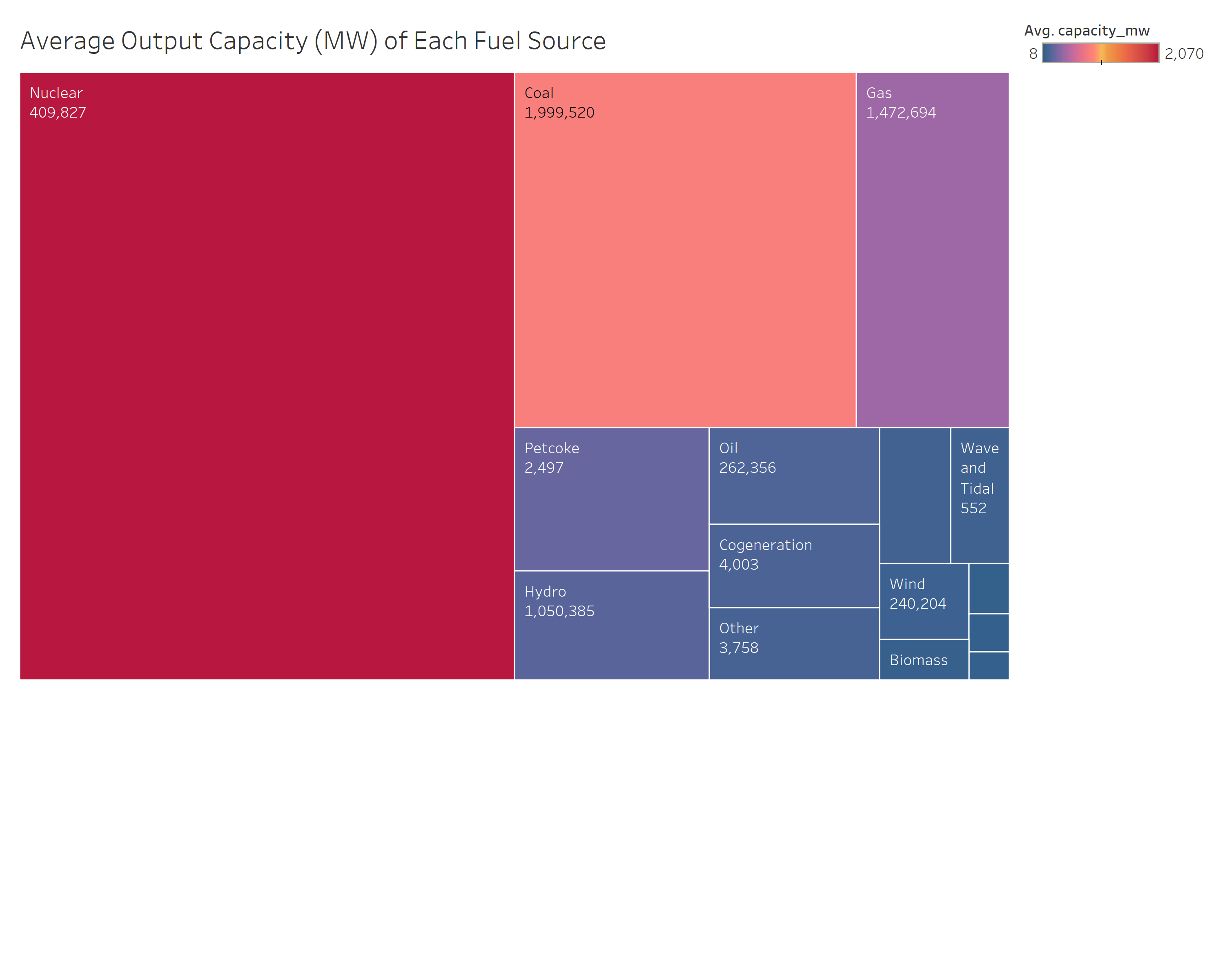
I am analysing the average output capacity in mega watts of each fuel source around the world using a tree map with a heat-map colour scheme going from blue (smallest capacity) to red (largest capacity).
Visualisation:
Question:
I don’t know if this visualisation is displaying the information that nuclear energy is the next primary global source effectively.
Do you think there should be a sub-tree map in each fuel source showing the top 10 countries that are contributors to the primary tree map result?
Visual Design Type: Tree Map
Tool Used: Tableau Professional edition
Source To Dataset:
Global Energy Observatory, Google, KTH Royal Institute of Technology in Stockholm, Enipedia, World Resources Institute. 2018. Global Power Plant Database. Published on Resource Watch and Google Earth Engine;
URL:
http://datasets.wri.org/dataset/globalpowerplantdatabase
All opinions and ideas are welcome, thanks for reading and the help! ![]()
-Avi