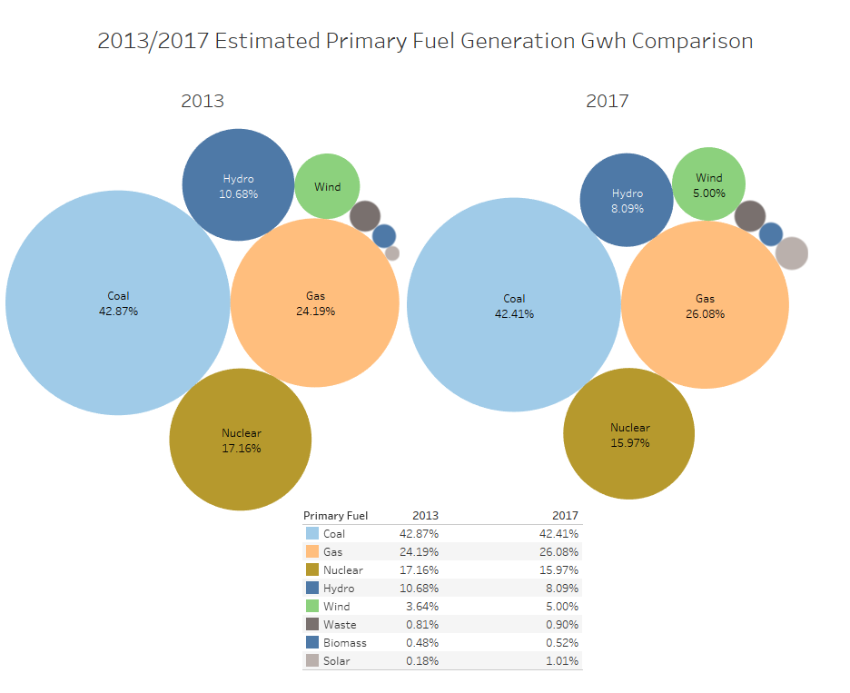
Visual Design Type: Packed Bubbles
Name of Tool: Tableau
Country: All countries in the Data set
Year: 2013 and 2017
Visual Mappings: Primary Fuel and % of Total Generation Gwh 2013 and 2017 respectively.
Colour shows details about Primary Fuel.
Size shows % of Total Generation Gwh 2013 and 2017 respectively.
The marks are labelled by Primary Fuel and % of Total Generation Gwh 2013 and 2017 respectively.
The data is filtered on the sum of Generation Gwh 2013 and 2017 respectively (non-null values only)
The view is filtered on Primary Fuel, which keeps 8 of 15 members.
Percents are based on the whole table for each year of 2013 and 2017.
Unique Observation:
Coal power is holding steady in usage.
Hydropower is becoming less frequently used as more wind power is generated.
The highest change in use is solar power, which has increased over 5 times its value from 2013 to 2017. Although this is still only 1% of the whole power usage.
While gas usage increased, Nuclear decreased by a similar amount.
Dataset Source: Global Power Plant Dataset
Data Preparation:
2 separate sheets for displaying separate packed bubble information, 2013 and 2017.
1 separate sheet for displaying the table of primary fuel figures.
1 dashboard to arrange all 3 sheets.
Primary fuel filter to show only top 8 using Total Generation Gwh.
Total Generation Gwh filter to filter out null values.
Change Total Generation Gwh output to percentage using analysis menu.
Questions:
- Is the change in fuel usage clear and concise from the visualisation alone?
- Is there a better way to show smaller circle percentages without the use of a table?
- Packed circles were chosen, but is there a better visualisation to display this type of data comparison?
- Any other suggestions?
Thanks for your time!