
Hello, I am a student from Swansea University attending a Data Visualisation module and as part of a coursework I am undertaking visualising health data from Project Tycho. I am visualising the three diseases Mumps, Influenza and Pneumonia across the United States of America. This visualisation is from the year 1912 to 2017, and I have used a map to visualise each state and their respected count for all three of the diseases.
Visual Design Type: Chloropleth Map
Tool: Tableau
Country, Disease and Year: United States of America, 1912-2017, Mumps, Influenza and Pneumonia.
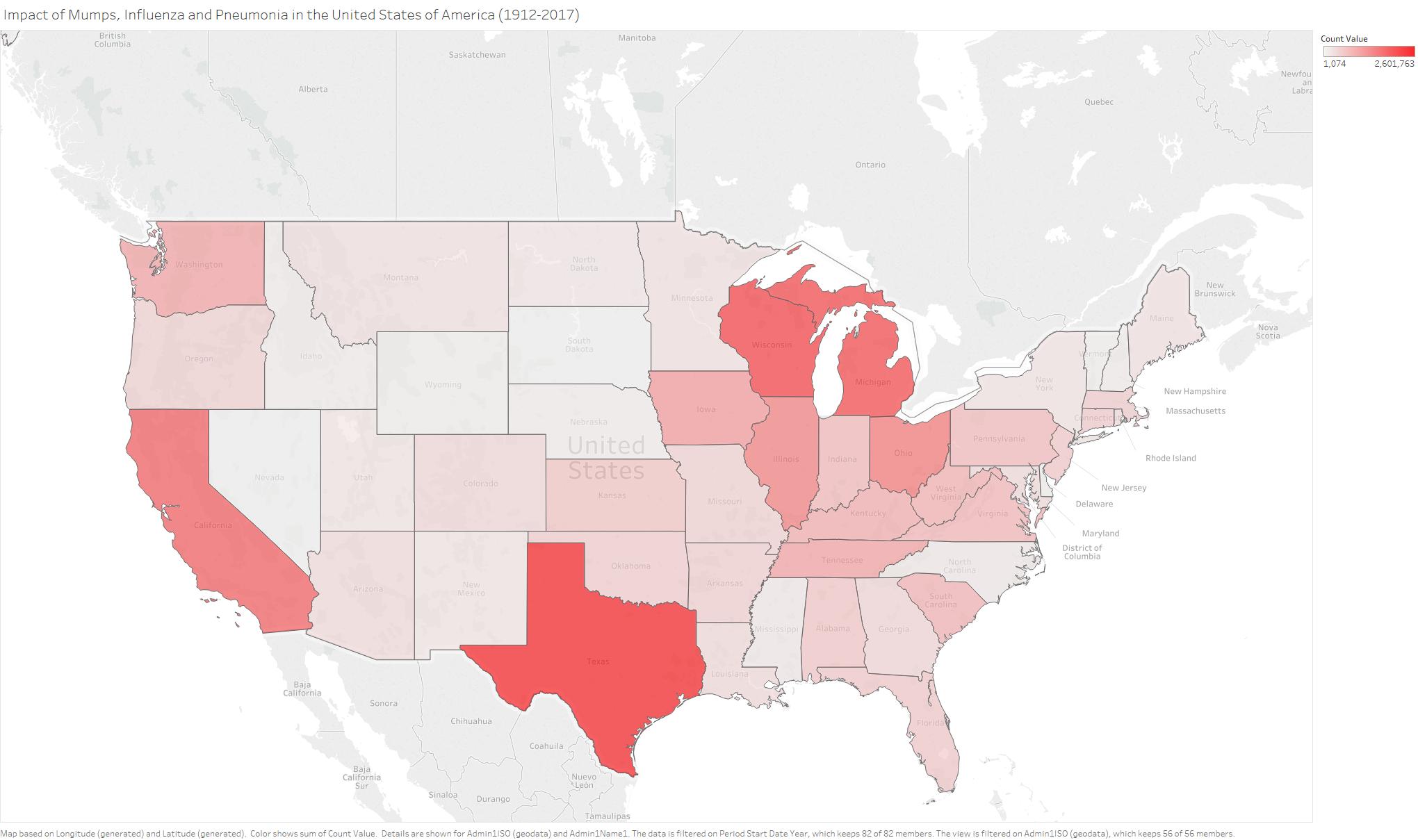
Visual Mappings: Colour applied to visualise count across each state to show the higher number of disease counts, such that white or light pink colours are lower counts and the more red colours are higher counts in the case of Texas breaking 2.6 million count.
Unique Observation: In my visualisation I can see that the Eastern states tend to have more cases of the three diseases than the western state with the state of California and Washington being outliers and Texas having the largest count of the three diseases at around 2.6 million.
DOI:
10.25337/T7/ptycho.v2.0/US.6142004
10.25337/T7/ptycho.v2.0/US.36989005
10.25337/T7/ptycho.v2.0/US.233604007
Data Preparation: The data was formatted by using a custom data set from Project Tycho to merge all 3 of the diseases into one CSV file.
Questions: Does my choice of colour make sense in this visualisation and could the visualisation be improved to provide more clarity/information?
Thanks,
Conor.