Hello,
I’m on my final year of Software Engineering course and I’m taking the Data Vis module. I’ve been tasked with the coursework where I need to visualise data from Project Tycho. I’ve chosen to visualise the Distribution of Viral Hepatitis types A and B in selected states and territories of the United States of America in 2006. Below are the details of my visualisation.
DOIs:
- 10.25337/T7/ptycho.v2.0/US.66071002,
- 10.25337/T7/ptycho.v2.0/US.40468003,
- 10.25337/T7/ptycho.v2.0/US.76795007,
- 10.25337/T7/ptycho.v2.0/US.25102003
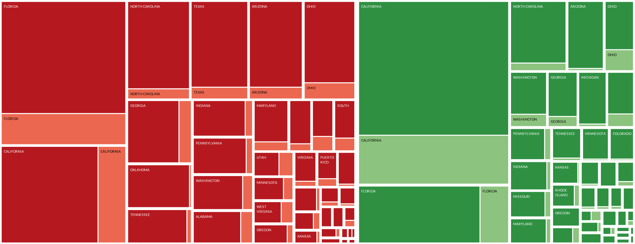
Visual Design Type: Treemap
Name of Tool: Tableau 2019.1 (Post processing in Adobe Illustrator)
Country: United States of America (and its territories)
Disease: Viral Hepatitis A & B (condition normal + acute)
Year: 2006
Visual Mappings:
The treemap was created by composing the data into following hierarchy (from outter nodes to child nodes):
- Hepatitis virus type (pathogen) (A / B)
- State / territory of U.S.A.
- Condition (standard / acute).
The color of each node represents different Hepatitis type, with red nodes presenting type B and green nodes type A. The shade of each node corresponds to the type of the condition - dark nodes depict the acute condition while light nodes depict standard condition, as described on the legend below the graph. Size of each node corresponds to the number of incidents for that given condition and state. Nodes are spaced out with padding. Nodes are positioned using squarified layout with nodes of highest incidence being placed on the left hand side, from top to bottom (within each dimension). Only the key states are annotated due to the huge disparity in the incidence.
Unique Observation:
It can be observed that across the entire graph, the incidence of Type B hepatitis has exceeded that of type A by around and accumulated to around 55% of the total Hepatitis incidence for the year of 2006. The highest number of incidents for a single condition can be attributed to Acute Type A Viral Hepatitis in California. On the other hand, by looking at the left side of the graph it can be noted that for the Viral Hepatitis type B, Florida was the state with greatest incidence. At the same time it can be observed, that in 2006 in all of the plotted states and territories, the acute version of the Hepatitis condition has had much greater impact than the standard one for both the type A and B (majority of the darker shade of red / green). A noticeable outlier can be seen among the key states for Type B Hepatitis - the state of Oklahoma, for which the standard type of this condition is abnormally small compared to the other annotated states.
Data Preparation:
The used data came from Project Tycho, for four different sets of data (each condition type, DOIs listed above) and was aggregated by computing the sum of the incidents for each condition 2006 for each of the states and territories. The range of years has been filtered to only allow 2006.
Questions:
1. I was wondering if the hierarchy I came up with is reasonable for this data set or should I perhaps use a different one (i.e. State → Pathogen → Condition)? I find it easy to tell what the distribution of the pathogen is across the U.S.A. with the current visualisation, but since it separates the data for the same state, it doesn’t seem like an easy way to tell what the distribution is for each of the states.
2. Could any further observations could be made about the data visualised on the first graph.
3. While data has all been gathered by the same entity (US Nationally Notifiable Disease Surveillance System) it comes from four different datasets. Do you think this affects the accuracy of the data?
Any help would be very much appreciated.
Best, Marceli