
Hi, as a part of my module Data Visualisation I was tasked to prepare a visualisation of Tychoo dataset. I am a Software Engineering student at Swansea University.
DOI: 10.25337/T7/ptycho.v2.0/US.25102003 and 10.25337/T7/ptycho.v2.0/US.76795007
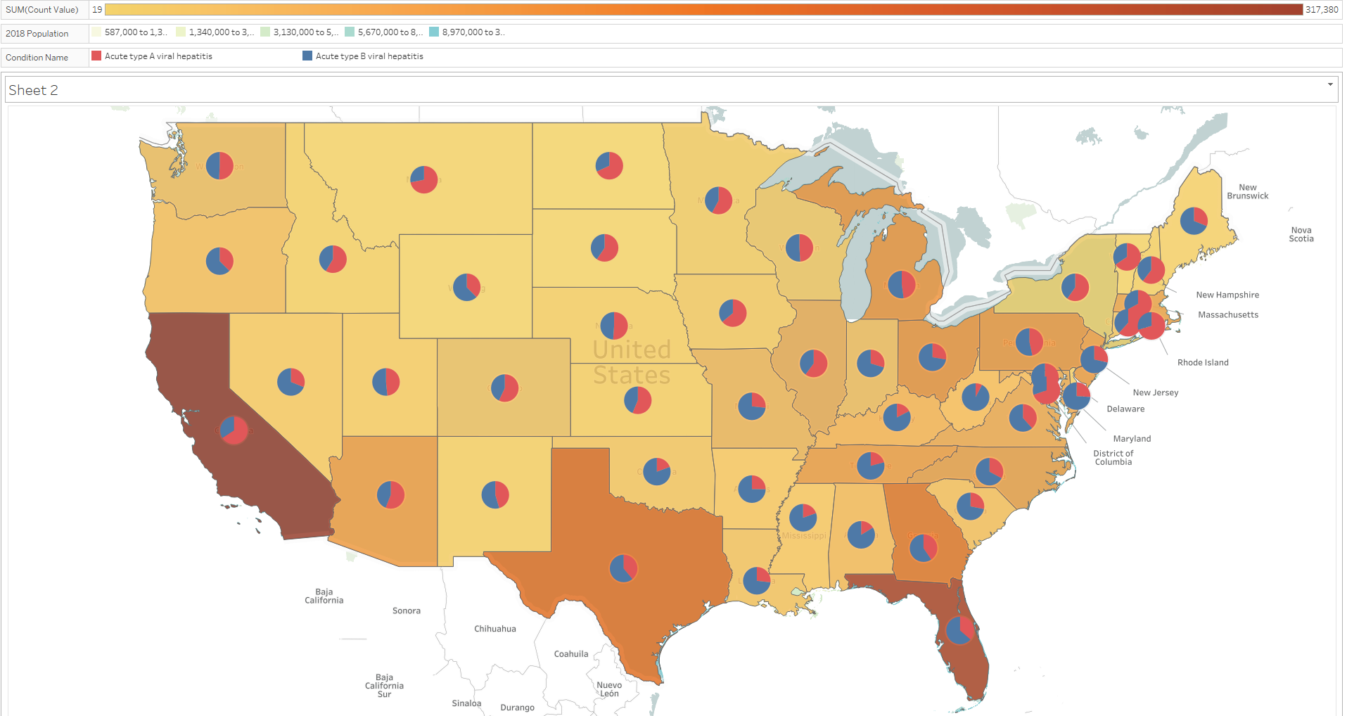
Visual Design Type: Pie Map Chart
Name of Tool: Tableau
Country: United States
Diseases: Acute type A viral hepatitis, Acute type B viral hepatitis
Year: 2001-2017
Visual Mappings:
Colour intensity represents the relative total count of both diseases for each of the state. The deeper colour, the more cases there were in total in a given state. The pie chart mapped to each of the state represents the share of the diseases.
Description: This pie map chart visualises the occurrence of acute type A and B viral hepatitis in the United States, comparing share of each of the disease type.
Unique Observation:
It can be observed that southern states had a noticeably higher number of cases than the northern states. California and Florida had the largest number of incidents, when South Dakota had the smallest number of cases. It can be also seen that acute hepatitis type B was dominating in the south-east part of the United States, when type A was dominant in the north-east.
Data Preparation:
To prepare the data, I had to decide to choose and visualise relevant information. I have combined datasets for acute type A and B viral hepatitis. Then, for each of the state, I summed them up and then calculated the share of each of the disease in the total number of cases for each of the state.
Question:
I am wondering how I could emphasise the prevalence of a given disease compared to the other in a more approachable way than a pie chart?
Kind regards,
Marcin Kolber