
Summary:
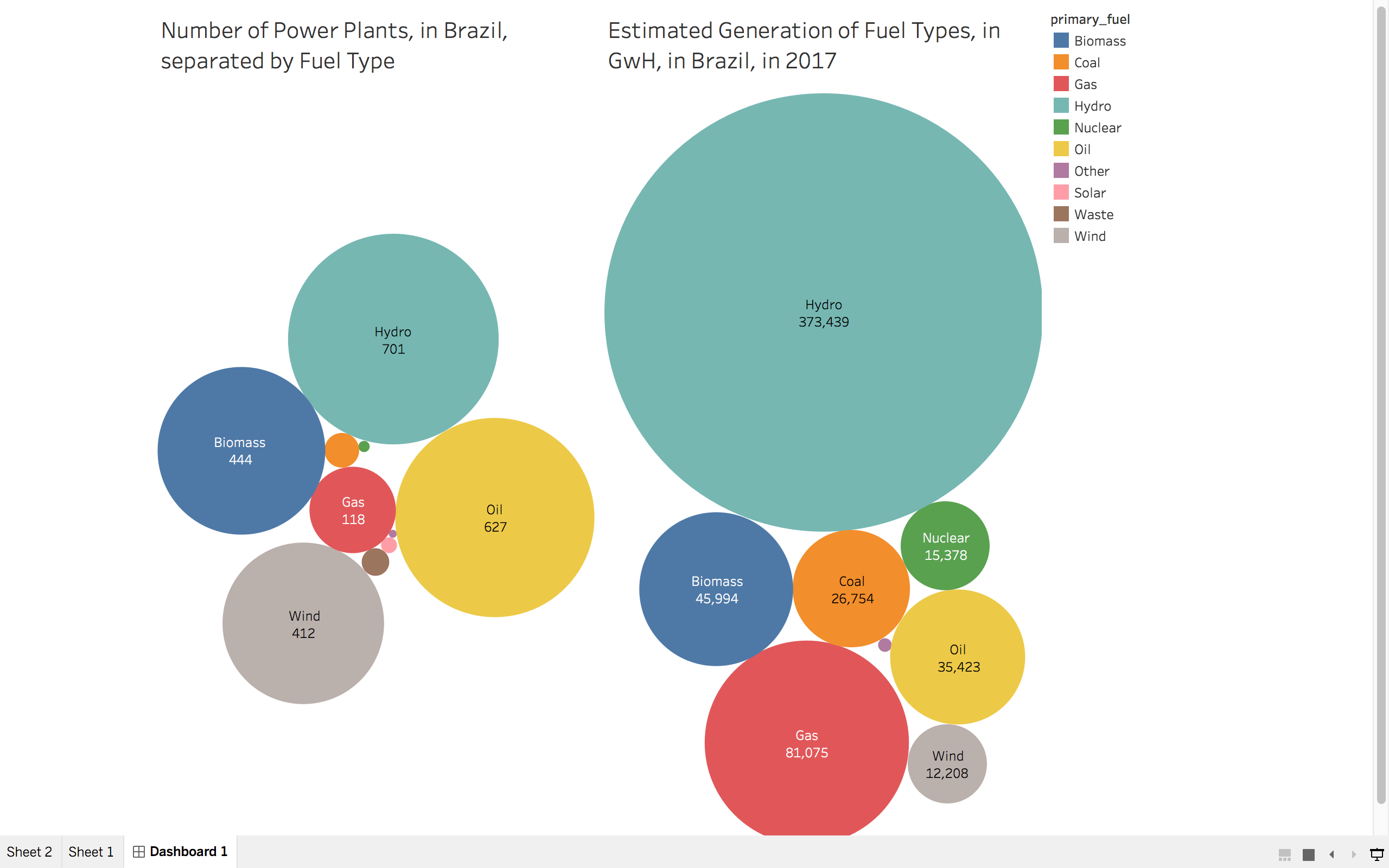
This is the visualisation that I have created to compare the number of Power Plants to the Estimated Generation of Each Fuel Type in 2017, in Brazil.
Image:
Name of Tool:
Tableau
Country:
Brazil
Year:
2017
Visual Mappings:
Colour - Represents the Primary Fuel Type
Size - Represents the Estimated Generation of Fuel, in GwH and represents the Number of Power Plants, per fuel.
Unique Observation:
Brazil has 627 Oil Power Plants, yet only produces 35,423 GwH. This is significantly less than Biomass power generation (45,994 GwH) and Gas power generation (81,075 GwH). However, both Biomass and Gas generation is more than Oil generation despite having a lot less power plants for each fuel generation. There are only 118 gas power plants and only 444 Biomass power plants.
Data Preparation:
I filtered the data, to only hold the data for Brazil, and put that data into a separate database.
Source:
References:
A Complete Guide to Bubble Charts:
Questions:
Does my Visualisation make sense?
Does this design choice represent the data well enough?
Are there any other designs which suit what I am trying to visualise better?
Is the colour scheme suitable for this visualisation?