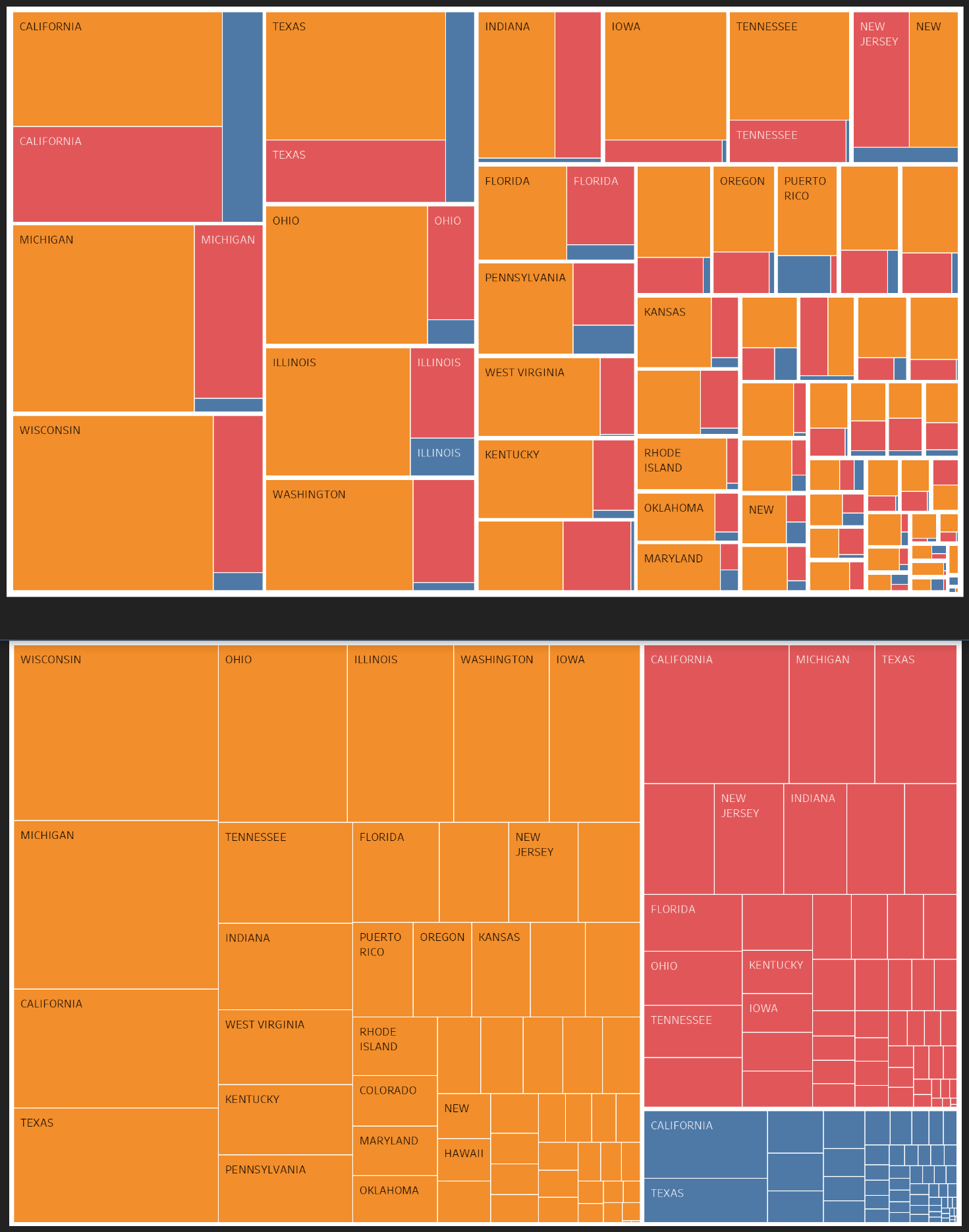
Description:
Visual design: Treemap
Name of tool: Tableau
Country: USA
Disease: Measles, Mumps, and Rubella
Year: 1923 - 2017
Visual Mappings: The sum of count for each disease mapped by state. Either by count first or state-first hierarchy. Where blue is measles, orange is mumps, and red is rubella.
Unique Observations: Significantly higher count of Mumps, significantly low count of measles. California has the highest count of all diseases.
Data Preparation: Three datasets (one for each disease) were combined. Columns matched and then data appended to each other.
The data is from Project Tycho, created using the “Compile your own” tool, available at tycho.pitt.edu/search/.
Individual DOI’s are:
- Measles: 10.25337/T7/ptycho.v2.0/US.14189004
- Mumps: 10.25337/T7/ptycho.v2.0/US.36989005
- Rubella: 10.25337/T7/ptycho.v2.0/US.36653000
I have reviewed literature including Ben Shneiderman’s Treemaps for space-constrained visualization of hierarchies available at cs.umd.edu/hcil/treemap-history.
Questions
- Which of the two visualisations are better?
- If neither, how might I improve them and make them optimal?
- Is there a better way I could visualise related diseases?
Thank you for your time.