Hello, I am trying to explore the Project Tycho data and could do with a second opinion on my visualisation of a comparison between west coast and east coast American states and how they responded to the rubella vaccine. Below is the visualisation itself and some various descriptions:
DOI: 10.25337/T7/ptycho.v2.0/US.36653000
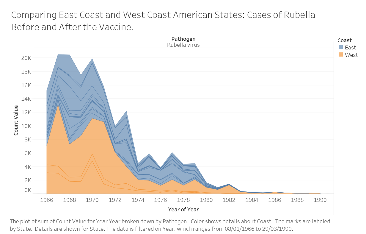
Visual Design Type - This visual design is an “Area Chart”. In this case, it shows the changing counts of diagnoses for the Rubella virus, comparing between East Coast and West Coast states.
Name of Tool - The Tableau analytics tool was used for this design.
Country - The country used for this data was the United States of America. However, the data was broken down further, geographically, by using only east coast (Virginia, South Carolina, Rhode Island, New Jersey, New Hampshire, Maine, Maryland, Massachusetts, Florida, Delaware and Connecticut) and west coast (California, Oregon and California) states.
Disease - The disease is the rubella virus.
Year - This data ranges from 1966 – 3 years before the Rubella vaccine was implemented in America, and 1990.
Visual Mappings - The data is split into two colours based on the coast, with blue representing the east coast states and orange representing the west coast states. The area for the graph is the total number of cases of rubella and individual case lines have been added to represent each state for this visualisation. The x-axis outlines the year, while the y-axis shows the actual count value.
Unique Observation - One key observation that can be made from this data, aside from the clear decline in Rubella cases after the vaccine becomes available in 1969, is that during 1973 – the East Coast states had a sharp rise in new cases that had no effect on the west coast. This is dissimilar to the other years, where both the East Coast States and West Coast States seem to follow the same general pattern.
Data Preperation - The key piece of data preparation to enable this visualisation was the collating of the data into two groups based on whether the state for that record a West Coast or an East Coast state. This was conducted on excel, after ensuring only west coast and east coast states were downloaded, by using some of the in-built excel functions to create a new column and identifying which coast each record belonged to.
References Used
-
Alice Thudt, Jagoda Walny, Charles Perin, Fateme Rajabiyazdi, Lindsay Macdonald, et al.. Assessing the Readability of Stacked Graphs. Proceedings of Graphics Interface Conference (GI), Jun 2016, Victoria, Canada. 2016, <10.20380/GI2016.21>.
-
Milligan, JN 2015, Learning Tableau, Packt Publishing Ltd, Olton Birmingham. Available from: ProQuest Ebook Central. [3 March 2019].
Question:
Is this visualisation too simple for making pertinent inferences and observations? While the decline in rubella cases is clear on both coasts, is there anything extra that should be added to improve this visualisation.
I also appreciate any general feedback or advice.