
Hello,
I am a BSc Software Engineering student who is currently undertaking a Data Visualization module. As part of my first assignment, I am given the task to visualize and explore Project Tycho’s data collection. Project Tycho is a data research program working with national and global health institutes and aims to increase the accessibility of global health informatics. My goal is to represent the spread of Viral Hepatitis A (HAV) and Viral Hepatitis B (HBV) across the years of 1952 to 2007.
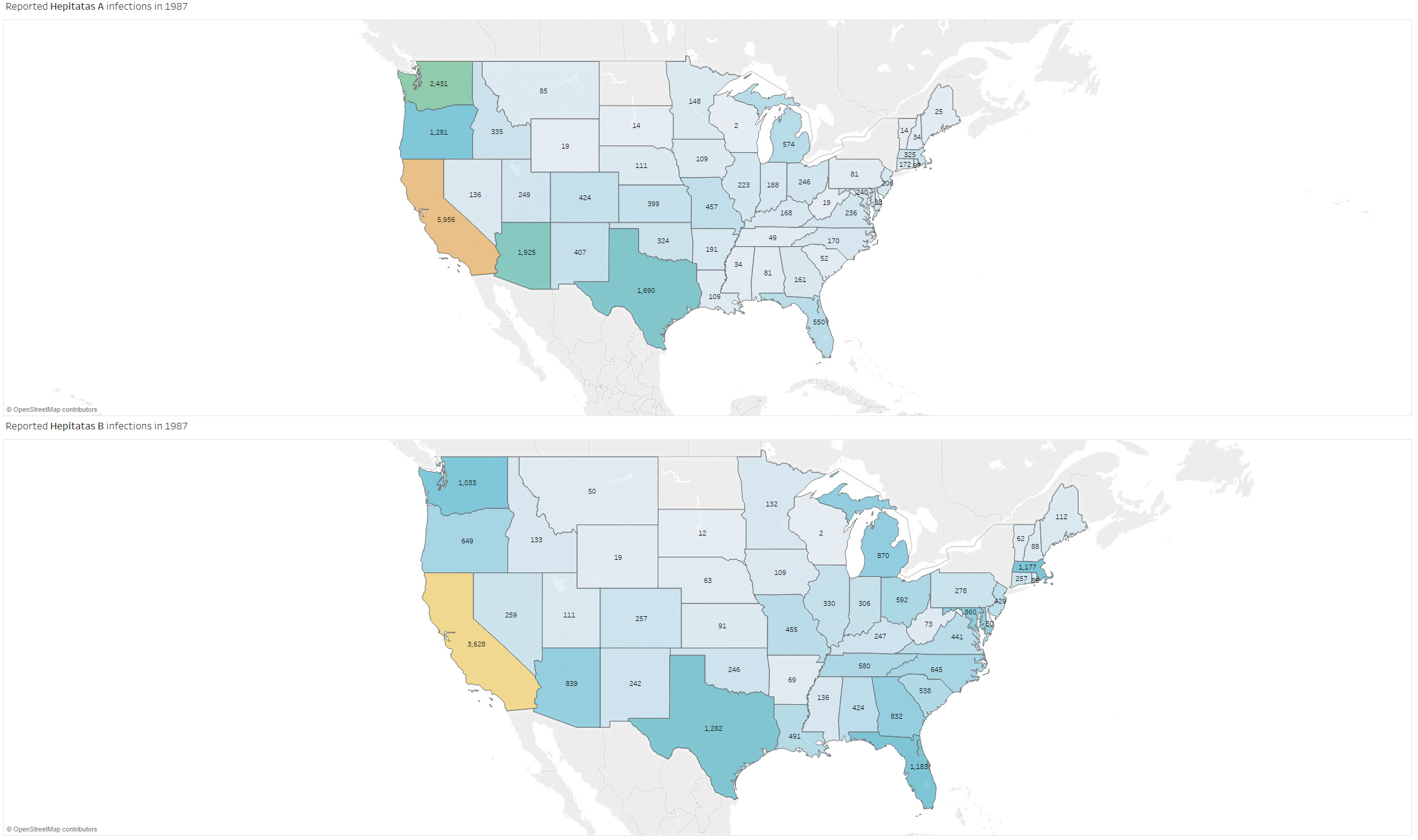
Image 1
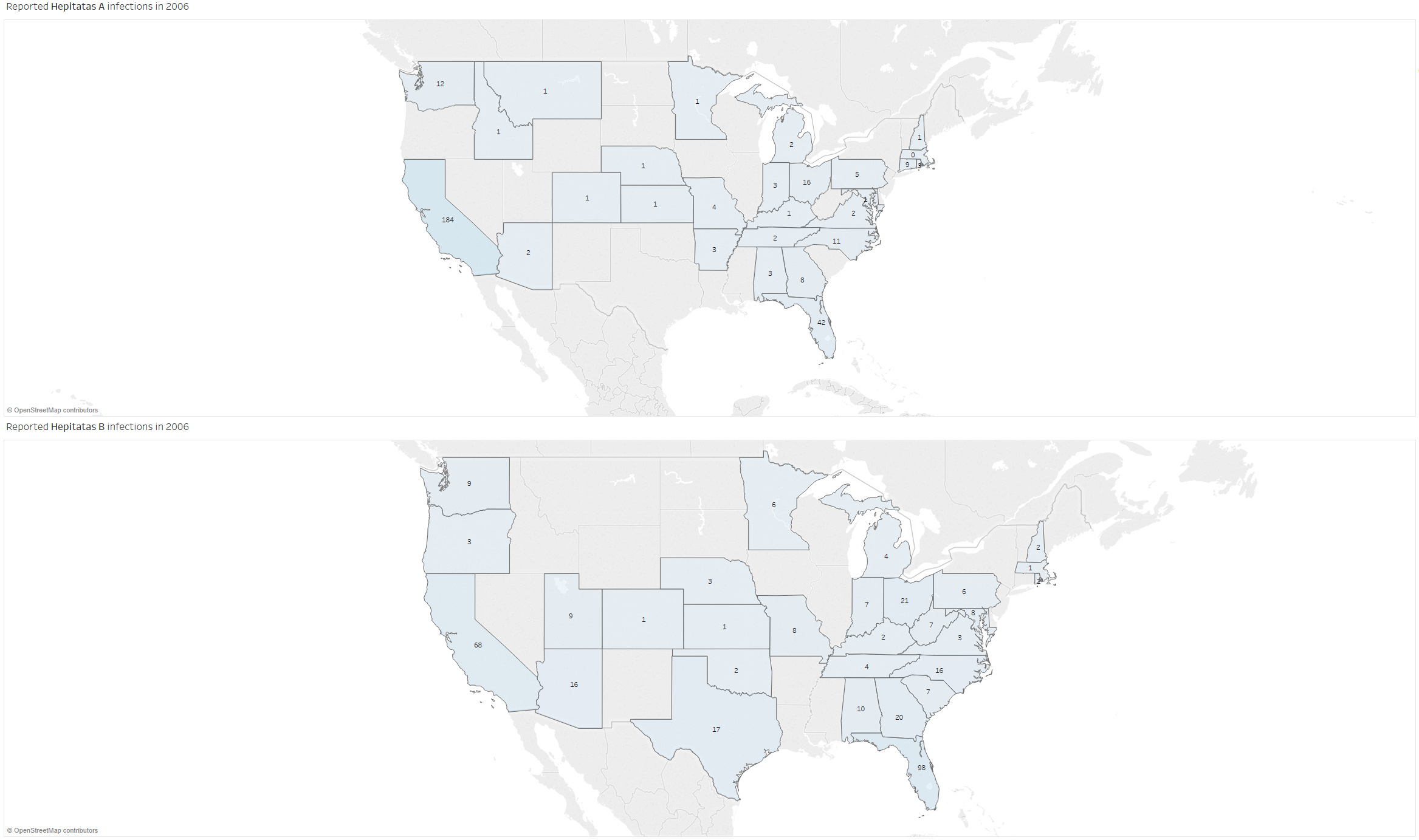
Image 2
DOI: 10.25337/T7/ptycho.v2.0/US.66071002
DOI: 10.25337/T7/ptycho.v2.0/US.40468003
Visual Design Type: Choropleth Map (one for each data set)
Name of tool: Tableau Desktop
Country: United States of America
States not taken into account: Hawaii, Alaska
Years: 1952 to 2007
Unique Observation:
In the provided screenshot we can see that the two infections are separated in their own choropleth map. Currently, the data can be observed over the duration of 1 year only. Each state is then mapped to a custom colour palette depending on the sum of all incidents in one state across a year. The palette diverts in the ranges from a very subtle light-grey to red creating a gradient. The number of infections per state per year are also included in the map for better perception of the data. From the screenshot, we can observe that in states where the population is high incidents tend to occur more often. Furthermore, it became evident when going through the data that records for particular states or even years were missing (Image 2: Year 2006). Nevertheless, from Image 2 we can see that the numbers of both HAV and HBV have significantly dropped when compared with Image 1. This leads to the conclusion that after the introduction of vaccines infection rates have declined.
Vaccine Introduction:
Viral Hepatitis B: 1981 (US), 1986 (US) recombinant version [1][2]
Viral Hepatitis A: 1995 (US) [3]
Data Preparation:
The data is acquired from Project Tycho is non-cumulative and has been aggregated by taking the sum of all incidents that have happened in a particular state in a particular year.
Questions:
I would like to ask if there is an effective method to create a visual comparison of the above-mentioned infections in a meaningful manner which would represent their spread over the years?
I am also wondering how can I incorporate a fatality rate for each state across the years?
References
- Hepatitis B vaccines WHO position paper. Weekly Epidemiological Record. 40 (84): 405–420. 2 Oct 2009.
- Moticka E. A Historical Perspective on Evidence-Based Immunology. p.336. 25 Nov 2015.
- Patravale, Vandana; Dandekar, Prajakta; Jain, Ratnesh. Nanoparticulate drug delivery perspectives on the transition from laboratory to market (1. publ. ed.). Oxford: Woodhead Pub. p. 212.). 2012.
Kristiyan Vladimirov