
I am a student at Swansea University and part of an assignment was to visualise data obtained through Project Tycho (https://www.tycho.pitt.edu/) and I have chosen to visualise the impact of Dengue fever in part of Southeast Asia (specifically for this visualisation Cambodia, Laos, Vietnam and Thailand).
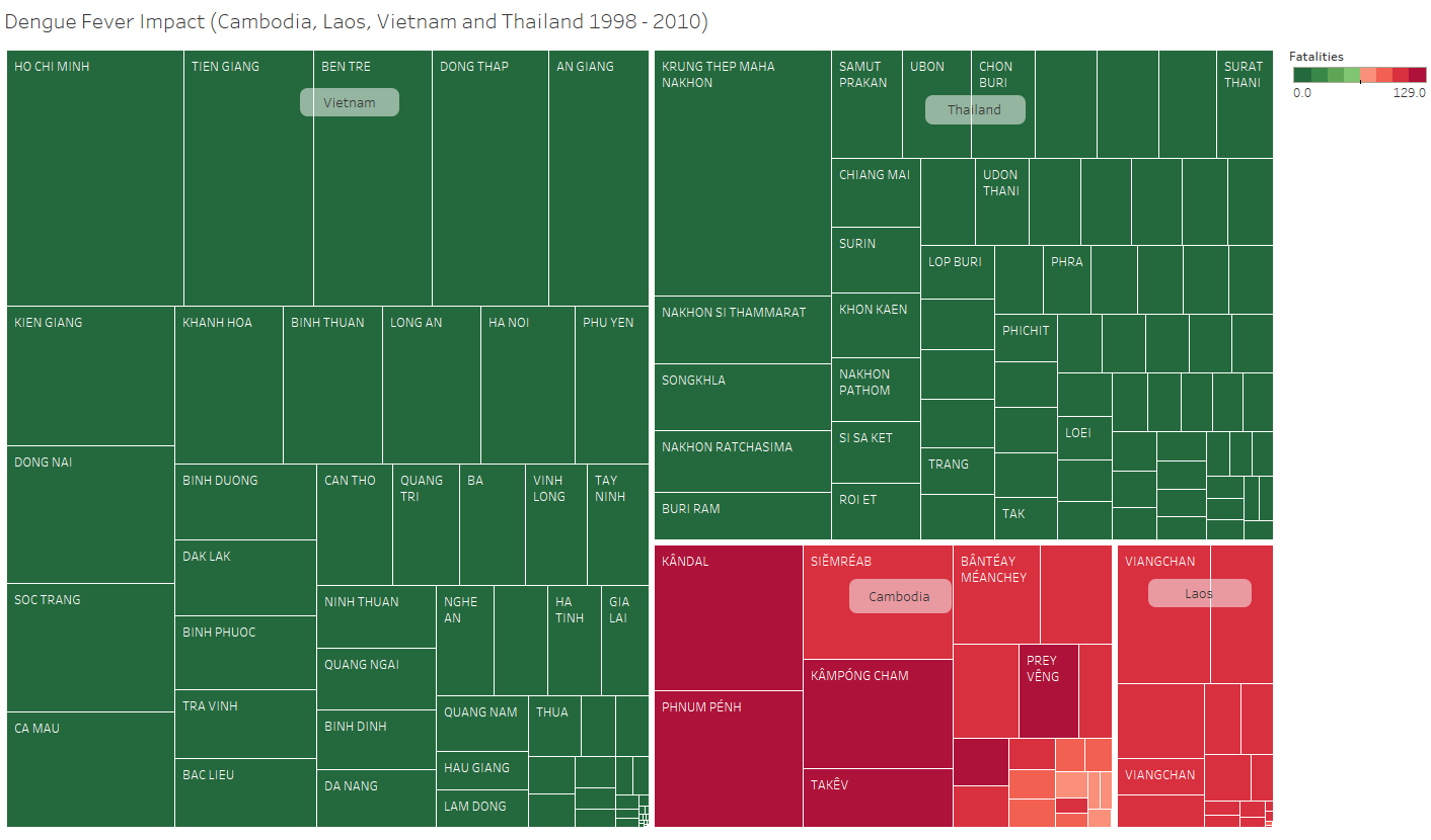
This is one of the visualisations that shows the spread and fatalities caused of Dengue in these 4 countries between 1998 - 2010 in the form of a tree map.
Any comments or recommendations would be appreciated however in particular, I am curious as to one question, what other visual layouts would show the impact of Dengue in a more effective way ?
Further information about the visualisation is below -
Visual Design Type: Tree map
Name of Tool: Tableau
Country: Cambodia, Laos, Vietnam and Thailand
Disease: Dengue
Year: 1998 - 2010
Visual Mappings: Color is mapped to the total number of fatalities recorded to have occured as a result of Dengue. The size of the nodes is mapped to the total number of recorded cases of Dengue and the nodes are also subdivided into countries and provinces of the location where the record occurred.
Unique Observation: From this visualization we can see that Cambodia and Laos, while having the lowest raw number of cases have the highest number of fatalities resulting from this disease. That there is other factors that determine the impact or fatality rate of a disease rather than just its numbers. Could be to do with Laos and Cambodia are ranked significantly lower in terms of overall global healthcare than Thailand and Vietnam despite all being in a very similar geographic region.
Data Preparation: The data was prepared by combining the records of Dengue from Cambodia, Laos, Thailand and Vietnam and only displaying those from 1998 - 2010, the only years all of the records shared, and also removing the records where the location was not known.
The DOIs of the datasets used are also given below -
Vietnam 1960 - 2010 - 10.25337/T7/ptycho.v2.0/VN.38362002
Laos 1998 - 2010 -
Non-Fatal Record: 10.25337/T7/ptycho.v2.0/LA.38362002
Fatal Record: 10.25337/T7/ptycho.v2.0/LA.38362002
Thailand 1993 - 2010 -
Non-Fatal: 10.25337/T7/ptycho.v2.0/TH.38362002
Fatal: 10.25337/T7/ptycho.v2.0/TH.38362002
Cambodia: 10.25337/T7/ptycho.v2.0/KH.38362002