
DOI: 10.25337/T7/ptycho.v2.0/US.56717001
Name of tool: Tableau
Country: United States of America
Disease: Tuberculosis (TB)
Time Span: December 1890 – December 1941
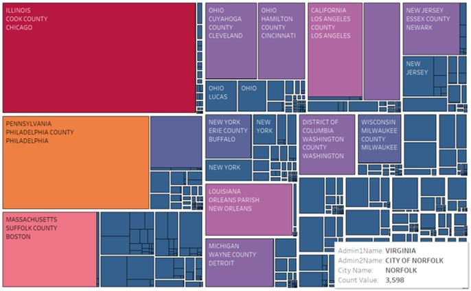
Data Preparation: Simply for ease of understanding the visualisation, records with NA as the county and city names have been removed as this data is deemed unreliable and incomplete
For the treemap above, a diverging sunset colour scheme has been used. Is this colour scheme optimal or would a sequential colour scheme be more efficient?
The following article uses a diverging colour scheme within a hierarchical visualisation, supporting the choice of my own colour scheme:
School of Information Systems and Technology, University of Wollongong, Wollongong NSW 2522, Australia
Thank you for any reply,
Thomas Taylor