
Attachment:
DOI: DOI10.25337/T7/ptycho.v2.0/US.14189004
Tool: Tableau
Context:
Hello,
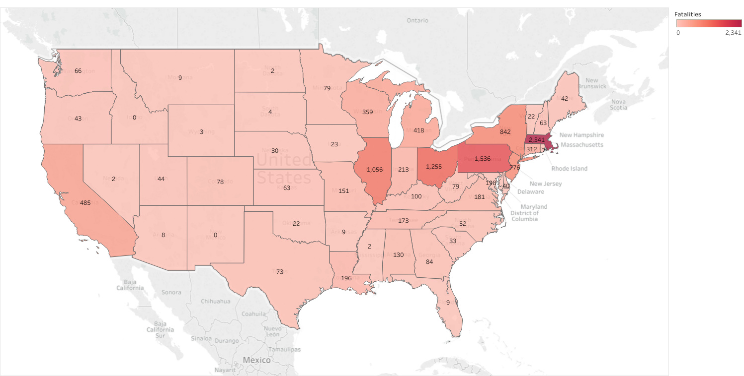
I am a BSc Computer Science student, currently undertaking a Data Visualization module. As part of my coursework, I am exploring the Project Tycho dataset. I am currently looking at ways to visualize the amount of fatalities claimed by the Measles virus in the United States over a 100 year period, specifically 1900 - 2000. I have produced the attached geospatial map using Tableau. The sum of fatalities in each state is mapped both to the colour (darker shade of red implies more fatalities) and the labels, which give exact values.
From the visualization, it is clear that several states in the north-eastern regions have historically suffered a significantly larger fatality rate than states in the Midwest region. We can also spot some interesting outliers - the states of Idaho and New Mexico have not suffered a single fatality due to the virus over the entire 100 year period.
Problem:
I am looking for ways to visualize the time dimension using a geospatial map such as the attached one. In particular, I would like to visualize the fatality counts in relation to their historical occurrence, perhaps in steps of 10 years. This would allow us to extract more information - visualize historical trends and identify outbreaks. I believe that animated visualizations (video), or interactive ones (a slider to select time slices) would be possible solutions, however my submission is to be printed on paper, invalidating these options.
Question:
As part of my research, I have been reading publications concerning the visualization of time series data. Many proposed approaches do not seem to mix well with geospatial mapping, such as Visualizing Time-Series on Spirals [1]. Jarke J. van Wijk and Edward R. van Selow [2] suggest calendar-style visualization, which could be applied in this case (e.g. splitting the observed time period into 25 year portions, and showing them separately). Would this be an acceptable approach? I am afraid that 25 years are still too long of a period to discover any non-obvious trends, whereas using shorter time slices would produce too many separate visualizations, making it difficult to observe them at once. Are there principles or standardized approaches to choosing the right amount of time slices for such situations?
I have attempted to imagine how we could introduce depth to a geospatial map in order to represent another data dimension, but I currently do not see how that could be achievable while also maintaining the integrity of geospatial mapping. I am intrigued to learn other approaches to visualizing time on a geospatial map. Please let me know if you have any suggestions or interesting examples of this problem being addressed correctly. I will also be thankful for any comments on my current visualization and how it could be improved.
Best,
Jan
I would like to assert that, although this is a marked coursework, I have been encouraged to seek professional help on this forum, and that my question does not violate the principles of academic integrity.
References:
[1] Weber, Marc, Marc Alexa, and Wolfgang Müller. “Visualizing time-series on spirals.” Infovis . IEEE, 2001.
[2] Van Wijk, Jarke J., and Edward R. Van Selow. “Cluster and calendar based visualization of time series data.” Proceedings 1999 IEEE Symposium on Information Visualization (InfoVis’ 99) . IEEE, 1999.