Hi,
I am a Computer Science student currently studying Data Visualisation and as part of my coursework I am exploring and visualising the Project Tycho dataset. Specifically, I’m comparing the number of infections and fatalities of Pneumonia and Influenza in the US from 1920 – 1929 (DOIs: 10.25337/T7/ptycho.v2.0/US.6142004 and 10.25337/T7/ptycho.v2.0/US.233604007). https://www.tycho.pitt.edu/
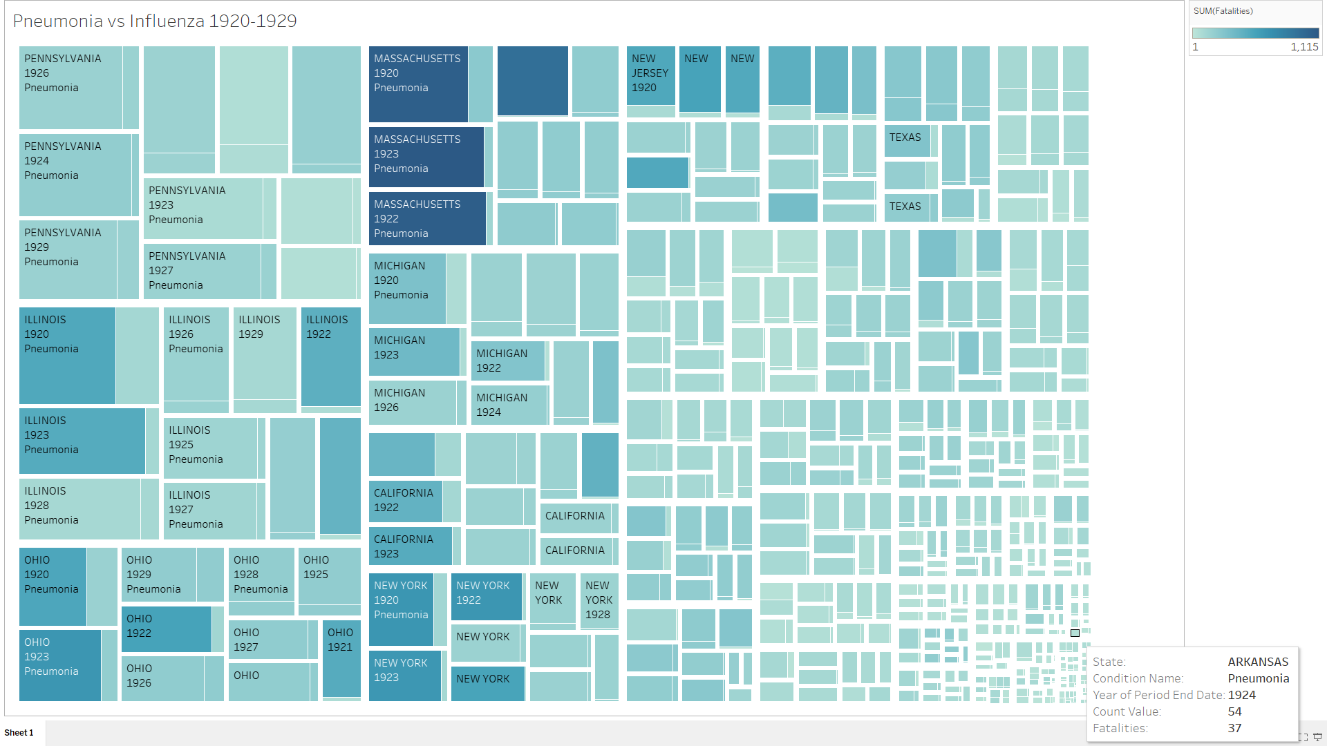
I have visualised this data using a treemap, with a hierarchy of State -> Year -> Disease. The size of the rectangles represents the number of infections and the colour represents the number of fatalities. I created this visualisation using Tableau and although it is interactive so all the data can be seen through the interactions, hovering the mouse over a rectangle will show all the data for that rectangle.
I have tried to stick to Tuft’s principles [1] and so I was wondering if there was a modification I could make, to the treemap or data, for me to more clearly show all of the data for all of the states? As the ones with fewer infections are harder to see. Also, are there any other improvements I could make to the visualisation.
[1] Edward, T. (2001). The visual display of quantitative information. Graphics Press, Cheshire, USA.